26/04/17

Calipsa

Calipsa

I worked alongside the CEO of Calipsa (who is also one of my university friends) developing the UI for an AI surveillance platform. You can learn more about what they do at calipsa.io.

no responses
Calipsa
14/04/17

Protected: VisD Exercise

This content is password protected. To view it please enter your password below:

no responses
Protected: VisD Exercise
16/03/17

Hixle

Hixle.co

I’ve been working on a side project aimed towards designers. The app curates the latest design styles including colours, fonts and tools from the best designs around the web. These assets are the fundamental building blocks of visual design so it’s a great source of inspiration to have.

I’ve also been wanting to scratch my own itch and build something useful whilst bolstering my coding skills, so here I present to you….hixle.co!

no responses
Hixle
22/11/16

C U B 3 D

C U B 3 D

I’ve been playing around with 3D interactions & transitions as I’m really getting into VR UI design. It requires a different approach as demonstrating 3D depth and perspective can be a challenge in most design and prototyping tools.

no responses
C U B 3 D
17/08/16

Floatable

Floatable

I’ve been experimenting with new and unusual layouts & styles. The idea was to distribute content without restricting it’s size based on its container. The grid is flexible and can easily be adjusted from fixed-width to full-width. The content is modular and includes elements that float off the page.

no responses
Floatable
07/02/16

Protected: Design Exercise

This content is password protected. To view it please enter your password below:

no responses
Protected: Design Exercise
07/02/16

Protected: IxD Exercise

This content is password protected. To view it please enter your password below:

no responses
Protected: IxD Exercise
23/10/15

Kalo Case Study

Kalo Case Study

PRODUCT DESIGNER

AngelList · Dribbble

Overview

My client, a former designer at Google approached me whilst I was wrapping up my latest design project. After graduating from TechStars and securing £1M+ funding for his startup Kalo, he needed help with creating a more visually appealing and robust platform. I was tasked with creating a new, intuitive UI for the Kalo desktop platform as well as redesigning the UX from scratch, prototyping, interaction and animation.

The Team

1

FOUNDER

1

CTO

1

PRODUCT DESIGNER

5+

ENGINEERS

Introduction

The Problem

The idea was to create a supplier management SaaS platform where clients can easily manage their vendors. My client explained that based on personal experience, it’s very difficult to manage external agencies and freelancers within a large organisation.

Keeping track of who is doing what, where and when could be managed much more efficiently in the cloud. The application was aimed at 2 target audiences, clients and suppliers.

Preliminary Stage

After having an initial conversation with my client, piloting the MVP and submitting the client survey to uncover the needs of the user, it was clear that this would be a challenge that I’d enjoy. He stated that he wanted to create the best possible experience through visuals, interaction and motion.

As design founders are quite rare to come across, I knew it would be a match made in heaven! After I gathered the necessary resources, I went straight to the drawing board and began researching competitors and sketching out ideas.

Skills

UI Design

UX Design

Interaction

Animation

Marketing

Deliverables

High Fidelity Mockups

User Flows

Wireframes

Interactive Prototypes

Animated GIFs

Style Guide

UI Kit

Spec Sheet

The User Interface

Initially I was tasked with undertaking a small design exercise to understand the workflow and design a base UI that could be iterated upon at a later stage. Designing a visual language that was going to be used consistently throughout the app provided me with an opportunity to explore new typography, layouts, accent colours and patterns.

When I inquired about providing inspiration to help with direction, it turned out that my client was just as much of a fan of Material Design as I was! The spec provided a great foundation for structure and common design patterns.

My goal was to create a visual language that was intuitive, easy to understand and delightful to use by guiding the user with feedback using motion. The UI is built with reactivity in mind, meaning that I could ensure the user never gets lost by guiding them with instant feedback during the start, middle and end of each action.

Inspired by material design, the structure is very modular as my aim was to minimise cognitive load by masking non primary actions inside of compact modules formed as independent buttons. I applied modularity as a design principle to help the user focus on the task at hand. By incorporating z-depth to display dimensionality, the modules appeared independent of each other even though their positioning was relative.

This reactive system also provides flexibility when using the app on a smaller device. An example of dimensionality is when a client attempts to add a supplier to a category, they can decide to add a new category if none are found. Selecting this option will trigger an inner module that is independent of the outer module. There’s no need to click back and forth and the task is not interrupted with alerts. Once a new category is added, feedback will be displayed instantaneously.

User Experience

The methodology employed was agile so each user story was formed into epics that are just a series of small user stories. Working directly with my client, I broke down each epic into user flows by identifying inputs, outputs, processes and other interactions to determine how best to achieve the goal in the shortest amount of time and with the least amount of effort.

The process is fairly iterative in order to prevent wasting time and resources. Each user flow, wireframe and mockup required frequent communication between my client, the engineers and myself. After the user flow was approved by the team, I then went on to creating the wireframes followed by the high fidelity mockups.

I had regular meetings with Peter (online and onsite) to discuss the design feedback and apply any amendments if necessary. I also collaborated with engineers to discuss the spec sheet and recommend improvements to the visuals that may have been missed, left untreated, or not aligned with the visuals in the mockups. Going agile can sometimes make the small details easy to miss!

My Contribution

Since April 2015, I have designed and iterated on over 200+ high-fidelity mockups for both desktop and Chrome, created countless user flows and wireframes, designed a full page marketing site, hand-coded interactive prototypes, animated logos, generated an intricate style guide and spec sheet.

Reflection

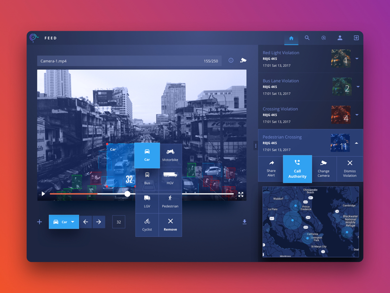
Even though the app is still in beta, I consider it a success based on what I’ve heard from real users so far. The feedback has been very positive! Kalo has already lined up some big name companies to pilot the app and they’ve received quite a bit of praise for the intuitiveness of the UI and UX.

To be part of building a product from the ground up and seeing it grow into a platform where real people use it has been surreal. It’s been a team effort that has required constant communication between myself, the founder and engineers. To make peoples lives better through design, even if it’s just a little bit, is why I do what I do.

no responses
Kalo Case Study
23/10/15

Satigo Case Study

Satigo Case Study

PRODUCT DESIGNER

Site · Dribbble

Overview

I was approached by a small recruitment firm based in Central London inquiring about a complete overhaul of their brand. My client required a full range of services including web, print and logo design. He wanted to move away from the generic recruitment agency style and introduce something fresh and modern. I thought it would be a great opportunity to try something new and see if I could challenge the status quo.

I was tasked with creating a new and modern brand, designing and coding a marketing site, designing print material including business cards and brochures, and designing and developing a sales dashboard.

The Team

1

FOUNDER

1

PRINTER

1

PRODUCT DESIGNER

5+

EMPLOYEES

Introduction

The Brand

The old Satigo brand was generic and predictable. The colours didn’t really represent the vibrancy of the agency and the style felt slightly outdated.

The Website

The website didn’t stand out amongst the saturated sea of agency sites across the web. Satigo had two target audiences – companies looking to hire, and candidates for hire. The static site didn’t really communicate Satigo’s mission clearly and there wasn’t any information about current opportunities available by the agency.

The Sales Dashboard

The company was having a hard time tracking their sales as they had to rely on tedious spreadsheets to see how the whole sales team was performing. The spreadsheets contained raw data that required lots of scrolling and wasted paper.

Preliminary Stage

I crafted a survey for my client to try a gauge his intentions, company information and target audience. A few phone calls later it was clear that the open-ended project would be quite a challenge that I would enjoy tackling. I then proceeded to devise a clear scope that outlined expectations, goals, milestones and deliverables.

Deliverables

Landing Page

Logo & Mark

Business Cards

Sales Dashboard

Skills

UI & UX Design

Print Design

Marketing

Coding

Constraints

The Brand

Reinvigorating an entire brand seemed daunting at first as there is no right or wrong solution. The output is very subjective and there can be countless revisions due to a lack of direction. Thankfully the survey narrowed down the requirements and provided me with a somewhat clear path to investigate. The logo and mark had to be recognisable in black and white, small and large and on web and print.

The Website

I was provided with examples of what my client saw as inspiration for the website. I took into account the keywords that were being described during our meeting to help with the direction. Words included modern, fresh, different, loud, one-pager, visual and not too text heavy. Defining which target audience to design for turned out to be quite a challenge as there was a clash between modern (candidates) and traditional (companies) styles. I had to ensure that both were being catered for. The website had to be fully responsive and work on all modern browsers.

The Sales Dashboard

The requirements for the dashboard were fairly specific as the sole purpose was to make it easy for my client to glance at the real-time sales statistics on a TV monitor instead of staring at rows and columns in a spreadsheet. So that meant the style of the dashboard had to be obvious, easy to digest and predictable. The dashboard also had to be fully responsive and work across all modern browsers.

The Process

The Brand

My client iterated that the brand should reflect Satigo’s mission of being a leader in recruitment. The logo and mark was to stand out and move away from the generic recruitment stereotype.

My process consisted of plenty of sketching, constant communication and many iterations. My intention was to get out as many ideas as possible, even if they did seem rough or wild! This left more room for experimentation. I used Illustrator and explored complimentary colour palettes. I mixed and matched colours that felt electric and finally settled on blue and orange. I would present my work for feedback, even if it was unfinished and then iterated as necessary. Rapid prototyping helped me get closer to the goal much faster.

Eventually we settled for an abstract mark that was bold, strong and dimensional. The simplicity of the design allows the mark to be easily positioned on the web regardless of whether it’s a social media icon, favicon, grayscale overlay or print such as signage, business cards, t-shirts and brochures. I finalised the assets in Illustrator and then the vector artwork was sent to the printers.

The Website

The marketing site had to communicate to both audiences – companies looking to hire and candidates available for hire. I had plenty of direction derived from the branding task so I knew roughly to approach the design.

I began sketching out wireframes that demonstrated the architecture and hierarchy of the information and overall layout of the one-pager. The brand colours were included along with the logotype. The copy was supplied by a copywriter so I had real data to play with.

Once the wireframes were approved, I then moved on to the high fidelity mockup. I approached the design mobile first as I could focus on the essentials without bloating the site with unnecessary visuals. Part of my task was to design the site similar to an infographic as opposed to a generic about us site. The font used was clear, bold and craved attention.

After the mockup was approved, I then began developing the site based on a static template that was recommended by my client. I had to convert the site to WordPress as a real-time ticker was required to display the latest jobs from the MySQL database. I adapted the template using HTML, CSS, jQuery, PHP and MySQL to fit the new design and ensured that it was cross browser compatible and fully responsive through testing.

The Sales Dashboard

I was tasked with transforming a large Excel spreadsheet into a real-time, interactive dashboard for the web. I gathered the requirements from my client through online and onsite meetings. The meetings consisted of presenting wireframes and deciding on the most appropriate chart to display every piece of sales data.

Once the wireframes were approved after many iterations, the high-fidelity mockups were designed. This step went rather swiftly as the dashboard is much more content-focused. I used flat design to keep the style simple and on-brand.

The design of the dashboard consisted of a sidebar for easy navigation access and a main content area for displaying the sales data represented by charts. Visuals are much more easier to digest than raw tabular data so a lot of pie charts, line and bar graphs can be seen across the app. The design of the sales form was important as that is what drives the dashboard. The limited amount of fields were carefully chosen in order to reduce cognitive load.

Reflection

The project was challenging, yet rewarding. I managed to develop some new skills and I also had the opportunity to push myself personally as well as professionally. My client (as well as his team) was very satisfied with the results and based on what I’ve been told, the project has helped them reach their goals of attracting new leads.

no responses
Satigo Case Study
23/10/15

Hixle Case Study

Hixle Case Study

PRODUCT DESIGNER

Dribbble

Overview

I’ve been thinking about different ways that could make my life easier as a designer. There are many tools out there that helps my design process but sometimes I have to scratch my own itch! I’m working on a side project to help designers like myself be more productive by building a new community where resources are easier to find, manage and share.

Skills

UI Design

UX Design

Branding

Marketing

Coding

Introduction

The Problem

There are a few issues that I frequently encounter when I’m working on design projects:

  1. I want to be able to cross reference designs with each other e.g. recommending similar projects for inspiration or search for projects based on multiple resources or tools
  2. It’s hard keeping up with trends so I want to see the latest font pairings, colour palettes, tools for prototyping used by other designers like yourself
  3. Learning – Whenever I see a project I like, I want to know how it was built so that I can dissect it by finding out which font or tool was used
Constraints

Designing an open-ended product where you are the client can be just as challenging as working with strict guidelines. I set constraints for myself to prevent feature creep, minimise perfectionism, and progress at a faster pace. Typically I would give myself 2 week sprints where I would exclusively focus on different parts of the project such as branding, UI design, UX design, icon design and marketing.

My Little Big Project

During the course of a few weeks, I let the idea manifest itself so that I could determine whether the solution was actually worth pursuing. Before I reached for my moleskin, I sent a few emails to a couple of fellow designers to see if there was any demand or whether they could resonate with the issues that I faced. It turned out that my assumptions were true!

I went ahead and followed up with a few more questions to try and refine the idea and gauge more interest. I used the lean methodology to ensure that I wasn’t wasting my time and building something that nobody wants by talking with potential users. Eventually I began seeing a pattern and deconstructed the feedback to mould into features shown below:

  1. Recommend projects and the resources used
  2. Recommend colour palettes for different project types
  3. Compare assets, discuss and recommend your favourite
  4. Add the resources used to a project
  5. Describe and deconstruct user flows
  6. Add tags on images to search like a designer (via emotions etc)
  7. Create relevant collections based on resources
  8. Add tools used to create a project

I then proceeded to draw a couple of rough sketches for the MVP. My intention was to validate the idea quickly and show something, even if it’s rough, to designers who I assumed would find it useful.

Over the course of a couple of weeks, I validated the idea and had a clear path to begin designing the high fidelity mockups based on the iterated wireframes. This meant quickly creating a brand and style guide.

I wanted the design to be simple, flat, modern yet flexible. Something that would work well with either a light or dark interface or a combination of both. The colour palette I chose was somewhat experimental yet retro and playful. I wanted the combination of electric and pastel colours to make the brand adaptable to the ever changing industry.

The branding contained a mark in the form of an exotic bird. I wanted the Hixle symbol to represent a part of me as this project came into existence based on my experiences as a designer. So even though I have my own story to tell, I wanted the brand to have it’s own story too. The gradient colours seen within the mark represent an animal that can adapt it’s appearance to any environment. Later on I may decide to include a logo type to compliment the mark.

Deliverables

Landing Page

Logo & Mark

Web Application Mockups

Reflection

The project is currently under development and I’ll soon be launching the MVP sometime in the new year. I wanted to give back what I have learnt throughout my years as a freelance designer. This project has given me an glimpse into how to approach the lean method and saving time, money and resources by talking to real people. I don’t know where this journey will lead to, it’s uncertain. But what I do know is that designers should have all the tools they need to create the best experiences.

no responses
Hixle Case Study