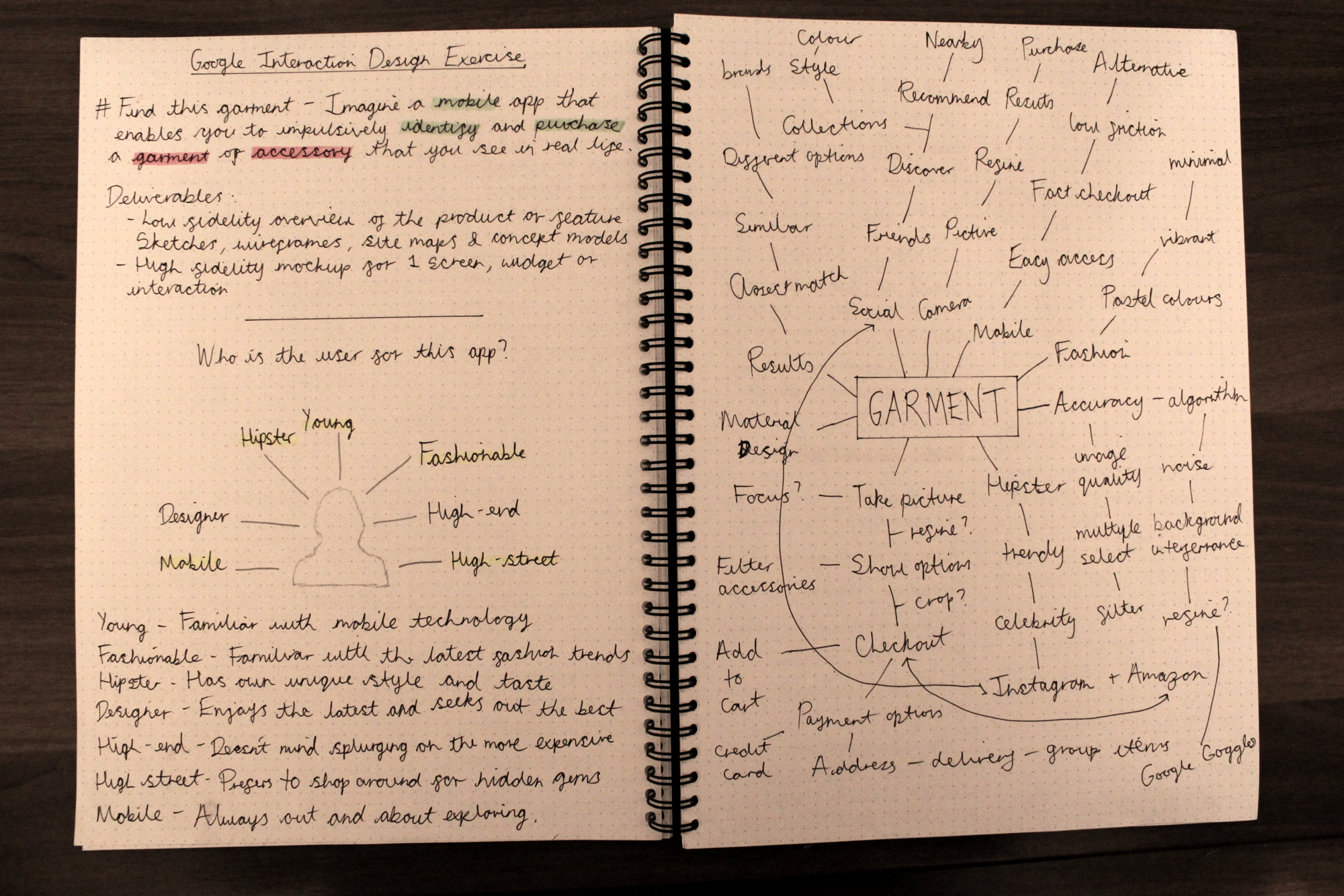
Find This Garment –
Imagine a mobile app that enables you to impulsively identify and purchase a garment or accessory that you see in real life. Design an end-to-end flow covering the experience from the moment of awareness to purchase completion.
I have been tasked by the design team at Google to envision an app enabling the user to capture and purchase items of interest using image recognition.
I will assume that natural language descriptions of images have matured and the device used consists of a relatively high quality camera. Images are also assumed to be taken in good lighting conditions.
I began by researching competitors that currently exist in the market. Based on what I gathered, there was a popular vote for point and shoot features. The majority of the apps required minimal steps from snapping a photo and returning the results. After reading the reviews, it turned out that the app relied heavily on the image processing algorithm which unfortunately was not as accurate as predicted. Nonetheless, the UI of the apps researched appeared intuitive and similar to each other.
In terms of the branding, I noticed that the apps employed rich and vibrant colours. I assumed that the target audience were the younger generation such as users who would be familiar with using Instagram and SnapChat. The apps were image heavy with limited text. Nearly all of them consisted of a light interface and a grid layout.


The brief stated that the app was for Google. As an avid fan of Material Design, I decided to incorporate the visual language into the app. The fonts used for the headings and paragraphs are both Roboto Regular and Condensed. The Ubuntu font was used for text containing numbers as I found it to be complimentary to Roboto whist taking up limited real estate within compact areas.
The colours chosen were inspired by the vibrancy of the fashion industry. Bold, vivid, electric and iconic are some of the words used to decide on the palette. As the app was aimed at the younger generation, I wanted to ensure that it will stand out from the masses.
I started to explore the idea of envisioning my own version of the apps that I previously researched. I believed that undertaking an action such as retrieving items from an image would be slightly different compared to the traditional search engines that only requires keywords or voice commands. Google Goggles painted a fairly accurate picture of what can be achieved through this but it seems to be a very challenging area to tackle due to a lack of high-end devices, image quality, analysis and speed or retrieval.
I began by attempting describe the characteristics of the user and the keywords associated with them. The brainstorming process helped me to unearth the relationship between the user and the goals. Finding connections can help foster new ideas. Finally I moved onto designing the rough sketches.
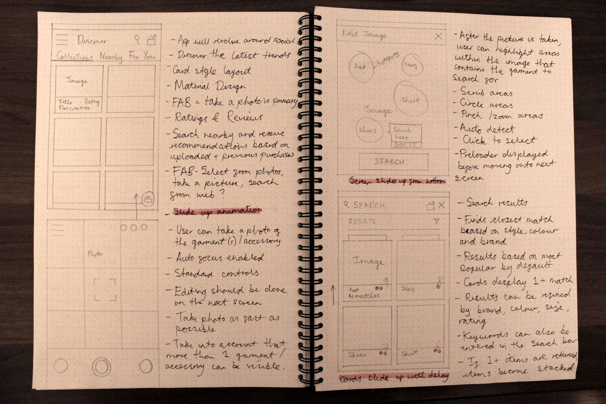
The rough sketches provided me with a foundation to begin tacking the problem. The main feature of the app was to allow a user to take a photo and then purchase the items derived from the photo. In between those two actions could consist of many micro interactions and processes.
The UX will be dependant on the algorithm used for identifying the object within the image. For example, the user may be instructed to highlight an area or if the technology is more advanced, then no interaction may be required. If the algorithm couldn’t detect any objects within the image, then will the entire process have to start again? What happens if the opportunity has already been missed? e.g. the person wearing the item of interest has left the building?
I began by putting myself into the user’s shoes and envisioning the steps required to undertake the task. Certain decision will have to be made along the way and one of the best ways of clarifying them is through an interaction flow.

Designing an interactive flow helped me to determine how the user thinks. As design is a set of decisions, mapping out the journey from inception to completion can validate whether my assumptions are in line with the user’s goals.
Edge cases can be tricky to detect and figuring out whether the flow is heading in the right direction can be a catch-22. Determining what to do when things go wrong will aid in making the user feel at ease as there will always be an option to opt-out if necessary.
I’ve also described the animation states to occur when a specific action is competed or in progress. Certain transitions such as making a screen slide in/out can also ensure that the user understand that they are progressing throughout the app.

As with most rough sketches, refinements will be required as you gain more insight about the goals of the app. I discovered that the navigation could be improved to enable a more seamless experience when going from screen to screen. I also illustrated how elements are connected to a screen in order to determine the target destination.
During this stage, I had to think more critically about how the user will be flowing around the content and interacting with certain elements. For example, the ‘taking a photo’ screen includes a camera button which when pressed, initiates a new screen. I had to determine whether the user will taken back the previous environment or whether a new screen will be initiated in order to move on to the next stage. I determined that moving forward should simulate a real life experience in terms of some level of uncertainty, but with consistent feedback.

As this design exercise leaned heavily towards interaction, I took into account how, when, why and where the user will interact with the UI elements. Determining the state of the UI whether it’s through colour, shape, form or motion can make or break the experience. I wanted to ensure that the user would be comfortable through consistent feedback throughout the journey.
The floating action button is a primary action sitting at the top of the screen element hierarchy. As the element sits behind the most dominant feature, I wanted the experience to be delightful. The FAB creates a wave effect as soon as the user presses up. Once selected, the short journey to discovering the mysterious garments and accessories behind the photo begins.


This interaction requires the user to scrub or smudge an area on the screen which contains the object of interest. This technique is fairly experimental as I believed it was the best way of getting from A to B in the fastest time possible, whilst also making the experience enjoyable.
I was inspired by colouring books as they’re known for being delightful to use. The paint brush effect inspires the user to paint objects on a canvas. An alternative would be to circle an area but as there could be many objects in the frame (some of them quite small e.g. earrings), it didn’t really seem practical. Plus it did not seem multi-touch friendly. As the user scrubs through the image, the overlay is removed revealing the object to search. Upon finger release, a circle dot is created to highlight the area affected.
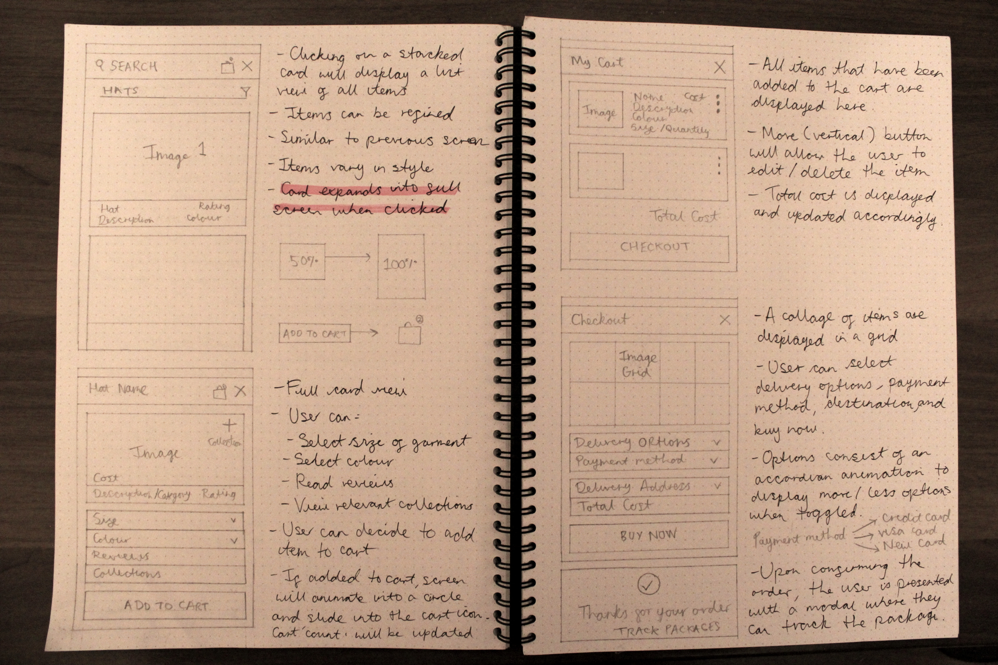
A toggle button eliminates the need for an additional button when attempting to complete more than one action. In a screen with limited real estate, the user can toggle each option to either display (active) or hide (inactive/default) information. This feature is widely used in popovers and navigation menus.
The user will be able to understand which state they are in through alternating styles and animation/motion. A default state will look similar to other relative elements as long as there is no interaction. An active state will see the item elevate through an animated drop shadow and the chevron icon rotated upwards.


As the UI relied heavily on cards (both vertical and horizontal), an added benefit is having the ability to interact directly through certain gestures. As cards are fairly compact and limited in their functions, users could discover new ways of completing actions through swiping left and right.
Here a card can be edited by swiping to the left and deleted from the right. These gestures are fairly universal so the leaning curve is small. This feature eliminates the need to include repeated icons or popovers.
Overall I enjoyed tackling the problem and exploring more of Material Design. Due to the restricted time limitations, I would have enjoyed developing an interactive prototype to demonstrate the context, interaction flow, motion, transition and states of the UI. I also believe the app would benefit from additional visual refinements. Finally, the hotspots relied heavily on the algorithm so unearthing edge cases through experimentation could have improved upon the experience.