My client, a former designer at Google approached me whilst I was wrapping up my latest design project. After graduating from TechStars and securing £1M+ funding for his startup Kalo, he needed help with creating a more visually appealing and robust platform. I was tasked with creating a new, intuitive UI for the Kalo desktop platform as well as redesigning the UX from scratch, prototyping, interaction and animation.
The idea was to create a supplier management SaaS platform where clients can easily manage their vendors. My client explained that based on personal experience, it’s very difficult to manage external agencies and freelancers within a large organisation.
Keeping track of who is doing what, where and when could be managed much more efficiently in the cloud. The application was aimed at 2 target audiences, clients and suppliers.
After having an initial conversation with my client, piloting the MVP and submitting the client survey to uncover the needs of the user, it was clear that this would be a challenge that I’d enjoy. He stated that he wanted to create the best possible experience through visuals, interaction and motion.
As design founders are quite rare to come across, I knew it would be a match made in heaven! After I gathered the necessary resources, I went straight to the drawing board and began researching competitors and sketching out ideas.
Initially I was tasked with undertaking a small design exercise to understand the workflow and design a base UI that could be iterated upon at a later stage. Designing a visual language that was going to be used consistently throughout the app provided me with an opportunity to explore new typography, layouts, accent colours and patterns.
When I inquired about providing inspiration to help with direction, it turned out that my client was just as much of a fan of Material Design as I was! The spec provided a great foundation for structure and common design patterns.
My goal was to create a visual language that was intuitive, easy to understand and delightful to use by guiding the user with feedback using motion. The UI is built with reactivity in mind, meaning that I could ensure the user never gets lost by guiding them with instant feedback during the start, middle and end of each action.
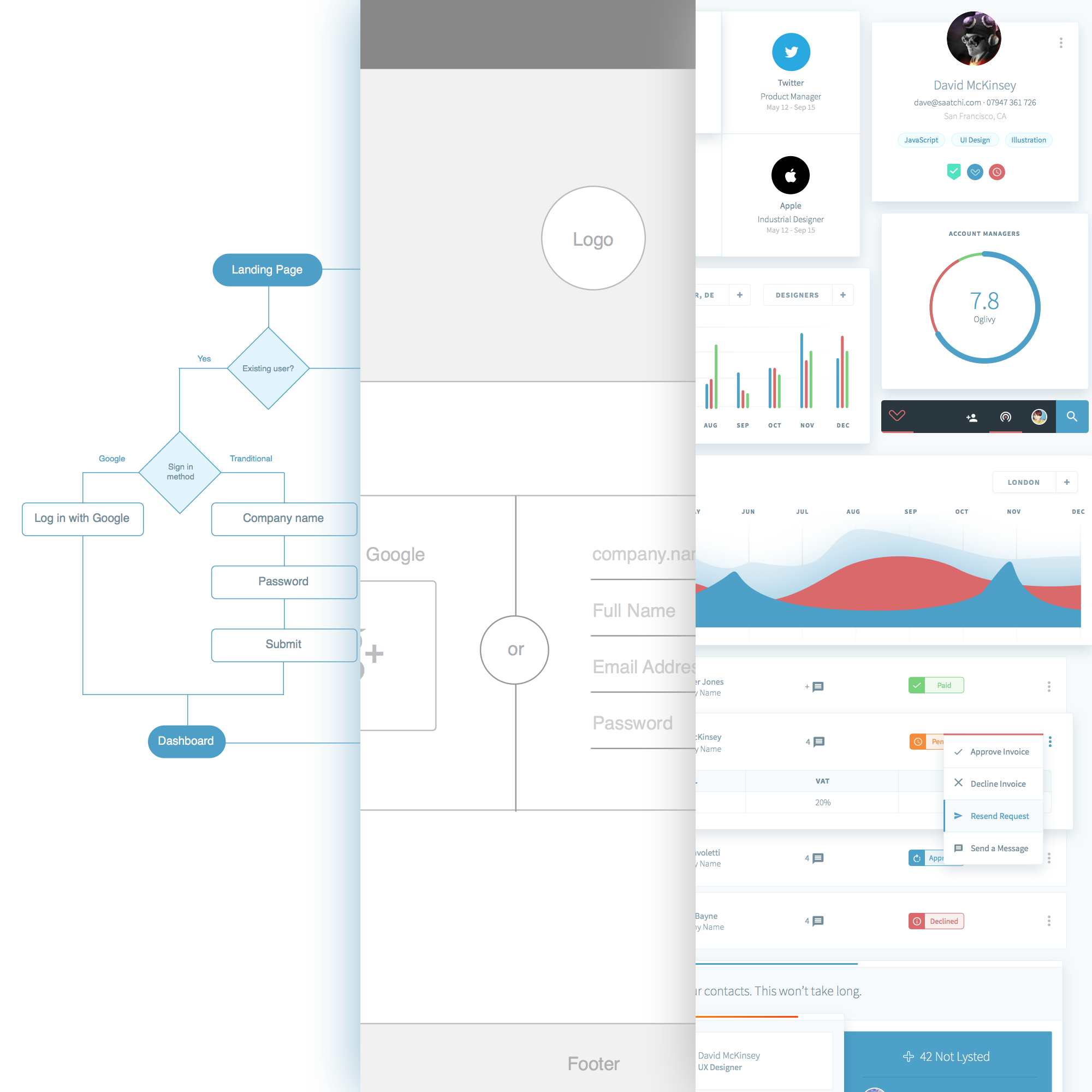
Inspired by material design, the structure is very modular as my aim was to minimise cognitive load by masking non primary actions inside of compact modules formed as independent buttons. I applied modularity as a design principle to help the user focus on the task at hand. By incorporating z-depth to display dimensionality, the modules appeared independent of each other even though their positioning was relative.
This reactive system also provides flexibility when using the app on a smaller device. An example of dimensionality is when a client attempts to add a supplier to a category, they can decide to add a new category if none are found. Selecting this option will trigger an inner module that is independent of the outer module. There’s no need to click back and forth and the task is not interrupted with alerts. Once a new category is added, feedback will be displayed instantaneously.
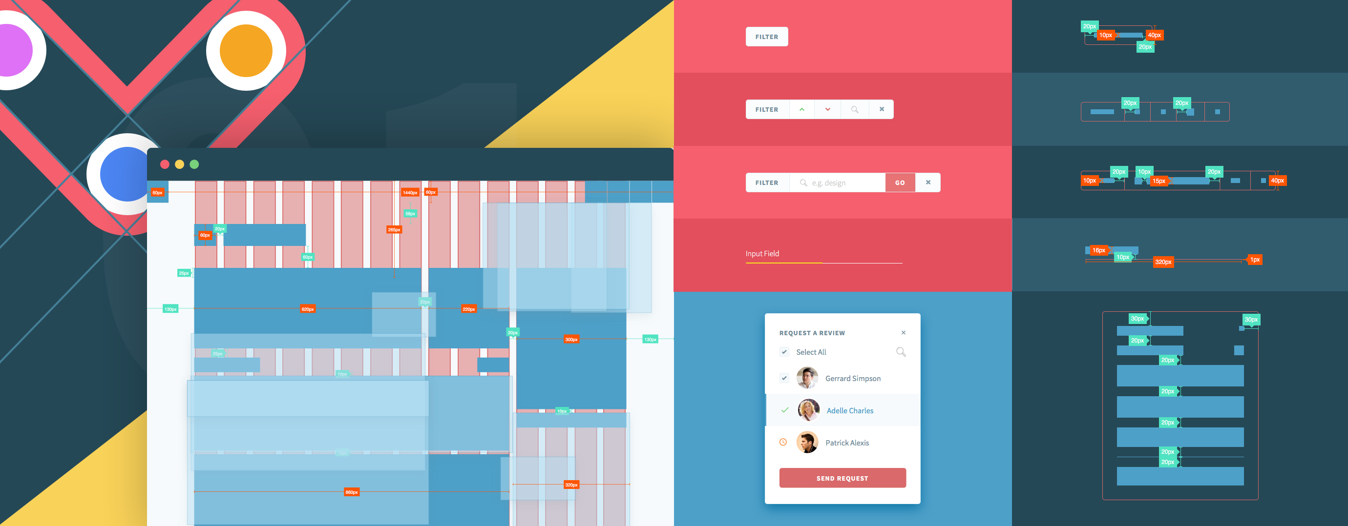
The methodology employed was agile so each user story was formed into epics that are just a series of small user stories. Working directly with my client, I broke down each epic into user flows by identifying inputs, outputs, processes and other interactions to determine how best to achieve the goal in the shortest amount of time and with the least amount of effort.
The process is fairly iterative in order to prevent wasting time and resources. Each user flow, wireframe and mockup required frequent communication between my client, the engineers and myself. After the user flow was approved by the team, I then went on to creating the wireframes followed by the high fidelity mockups.
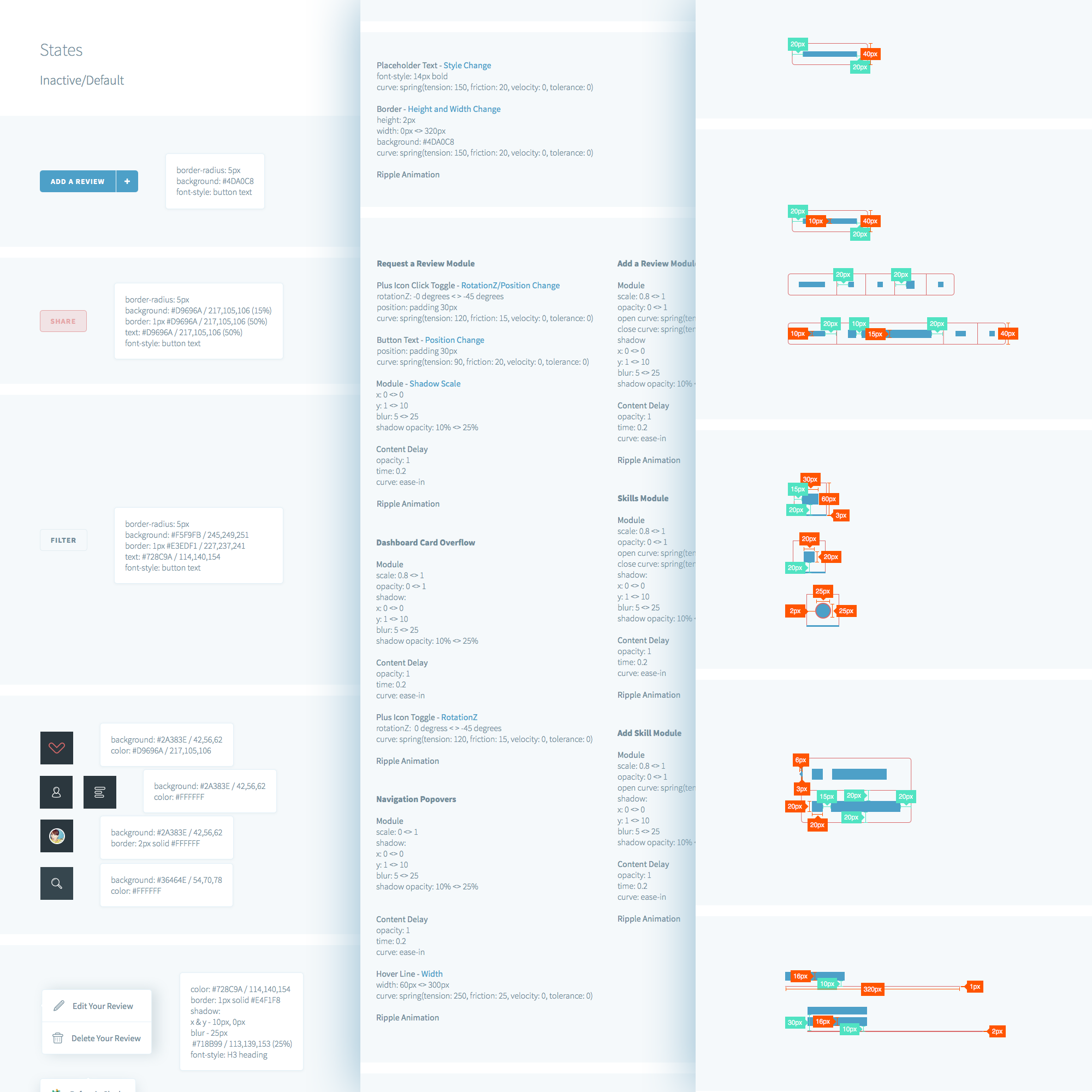
I had regular meetings with Peter (online and onsite) to discuss the design feedback and apply any amendments if necessary. I also collaborated with engineers to discuss the spec sheet and recommend improvements to the visuals that may have been missed, left untreated, or not aligned with the visuals in the mockups. Going agile can sometimes make the small details easy to miss!
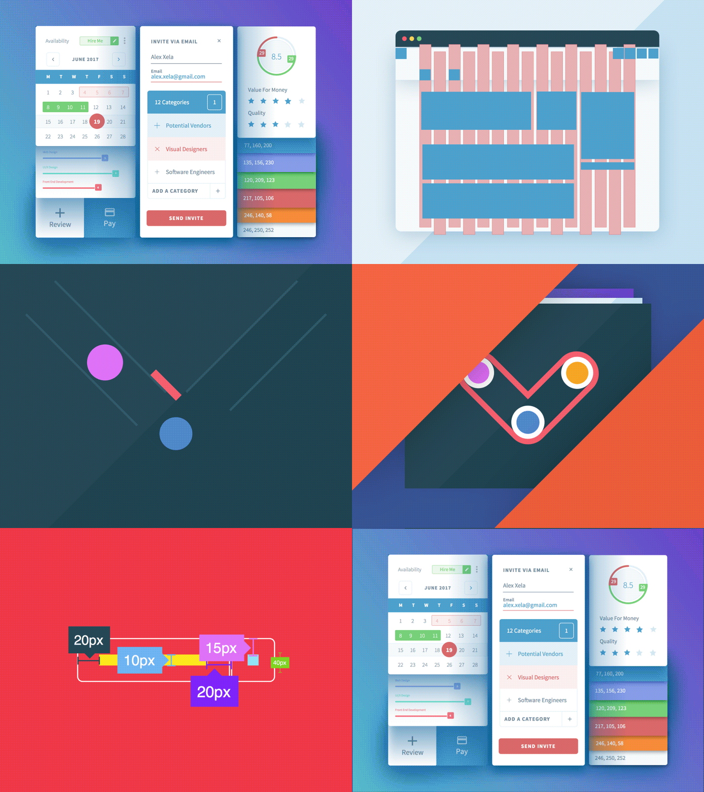
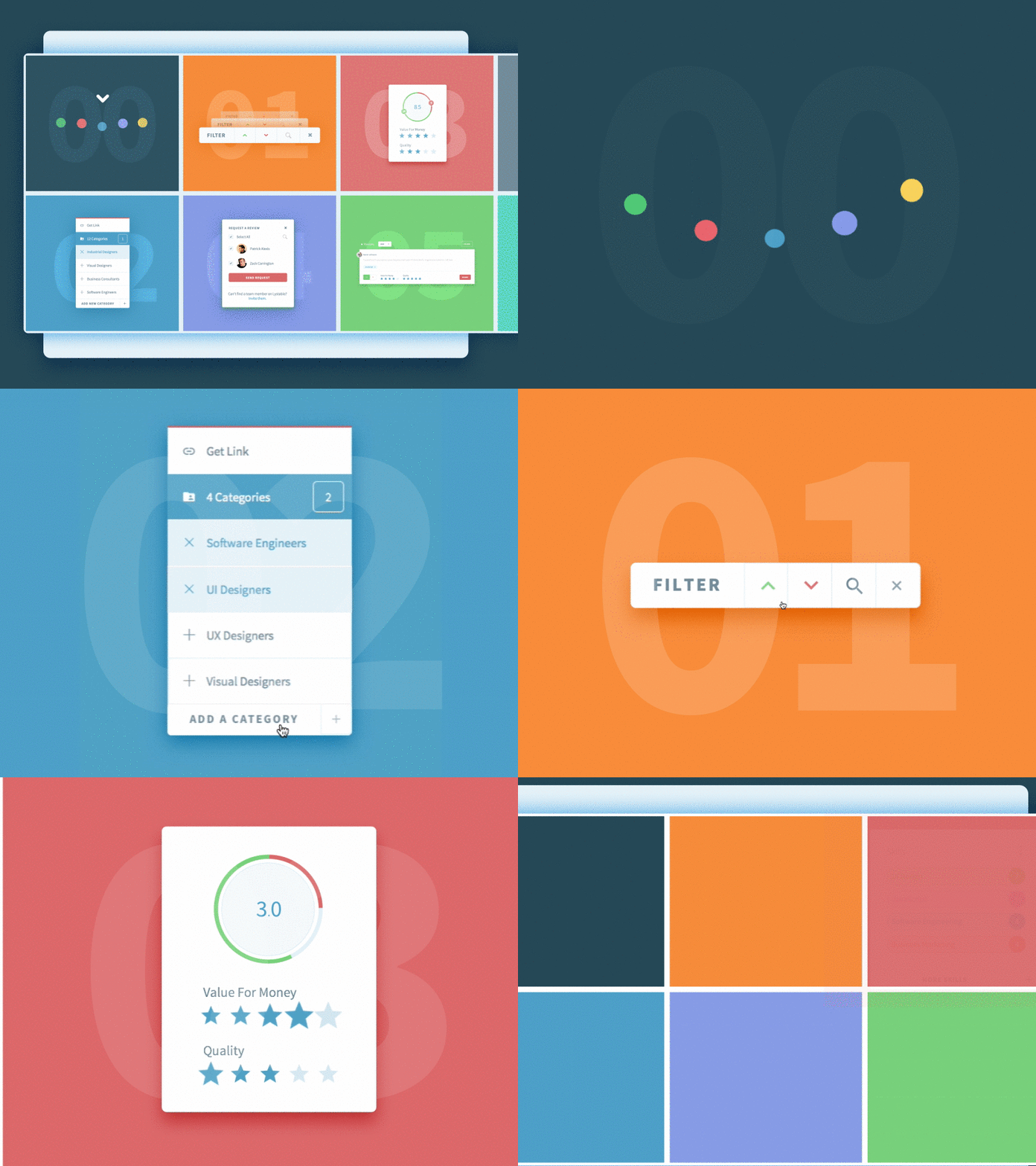

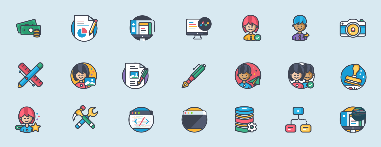
Since April 2015, I have designed and iterated on over 200+ high-fidelity mockups for both desktop and Chrome, created countless user flows and wireframes, designed a full page marketing site, hand-coded interactive prototypes, animated logos, generated an intricate style guide and spec sheet.
Even though the app is still in beta, I consider it a success based on what I’ve heard from real users so far. The feedback has been very positive! Kalo has already lined up some big name companies to pilot the app and they’ve received quite a bit of praise for the intuitiveness of the UI and UX.
To be part of building a product from the ground up and seeing it grow into a platform where real people use it has been surreal. It’s been a team effort that has required constant communication between myself, the founder and engineers. To make peoples lives better through design, even if it’s just a little bit, is why I do what I do.