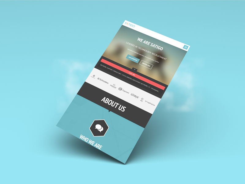
I was approached by a small recruitment firm based in Central London inquiring about a complete overhaul of their brand. My client required a full range of services including web, print and logo design. He wanted to move away from the generic recruitment agency style and introduce something fresh and modern. I thought it would be a great opportunity to try something new and see if I could challenge the status quo.
I was tasked with creating a new and modern brand, designing and coding a marketing site, designing print material including business cards and brochures, and designing and developing a sales dashboard.
The old Satigo brand was generic and predictable. The colours didn’t really represent the vibrancy of the agency and the style felt slightly outdated.
The website didn’t stand out amongst the saturated sea of agency sites across the web. Satigo had two target audiences – companies looking to hire, and candidates for hire. The static site didn’t really communicate Satigo’s mission clearly and there wasn’t any information about current opportunities available by the agency.
The company was having a hard time tracking their sales as they had to rely on tedious spreadsheets to see how the whole sales team was performing. The spreadsheets contained raw data that required lots of scrolling and wasted paper.
I crafted a survey for my client to try a gauge his intentions, company information and target audience. A few phone calls later it was clear that the open-ended project would be quite a challenge that I would enjoy tackling. I then proceeded to devise a clear scope that outlined expectations, goals, milestones and deliverables.
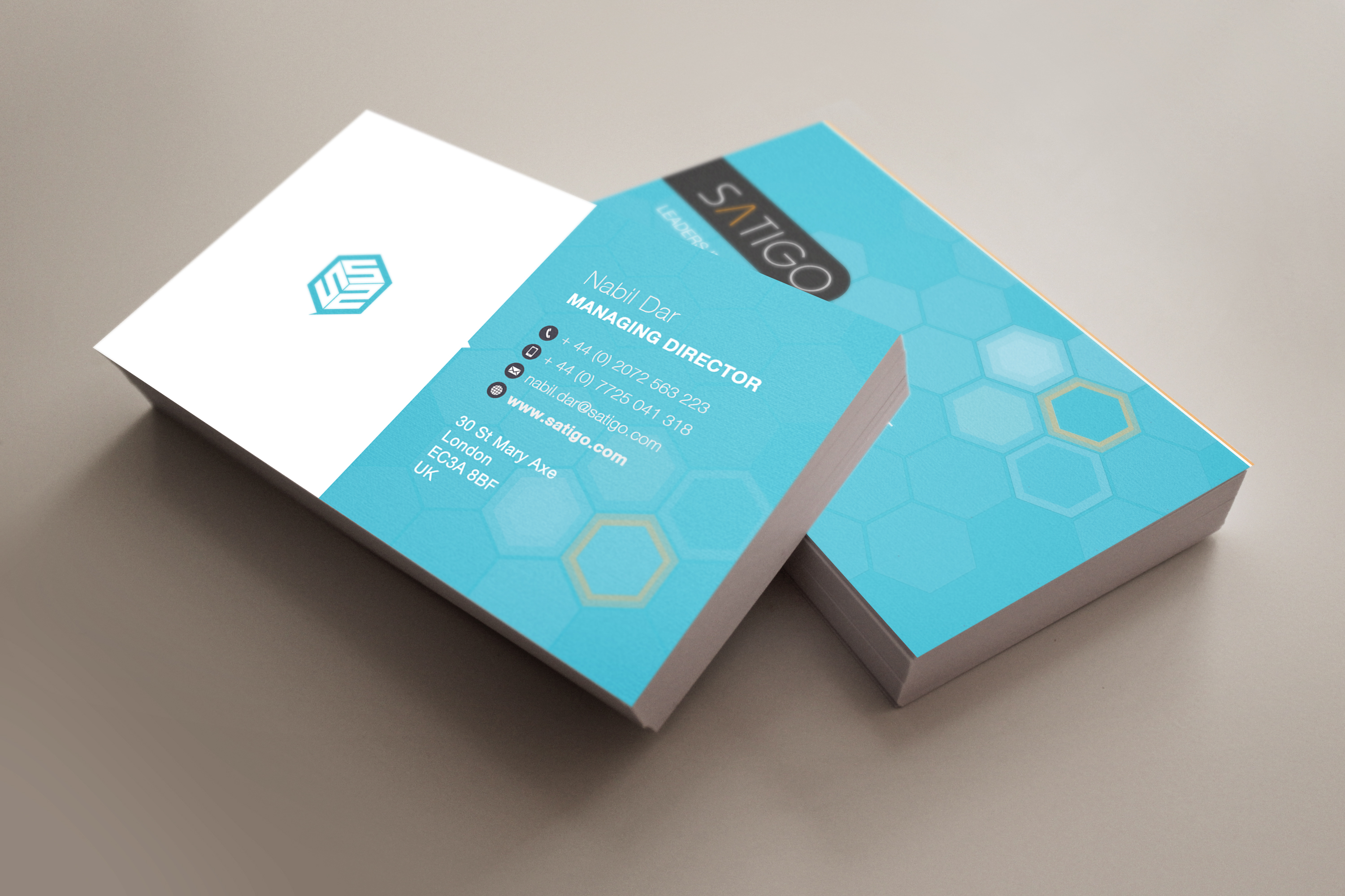
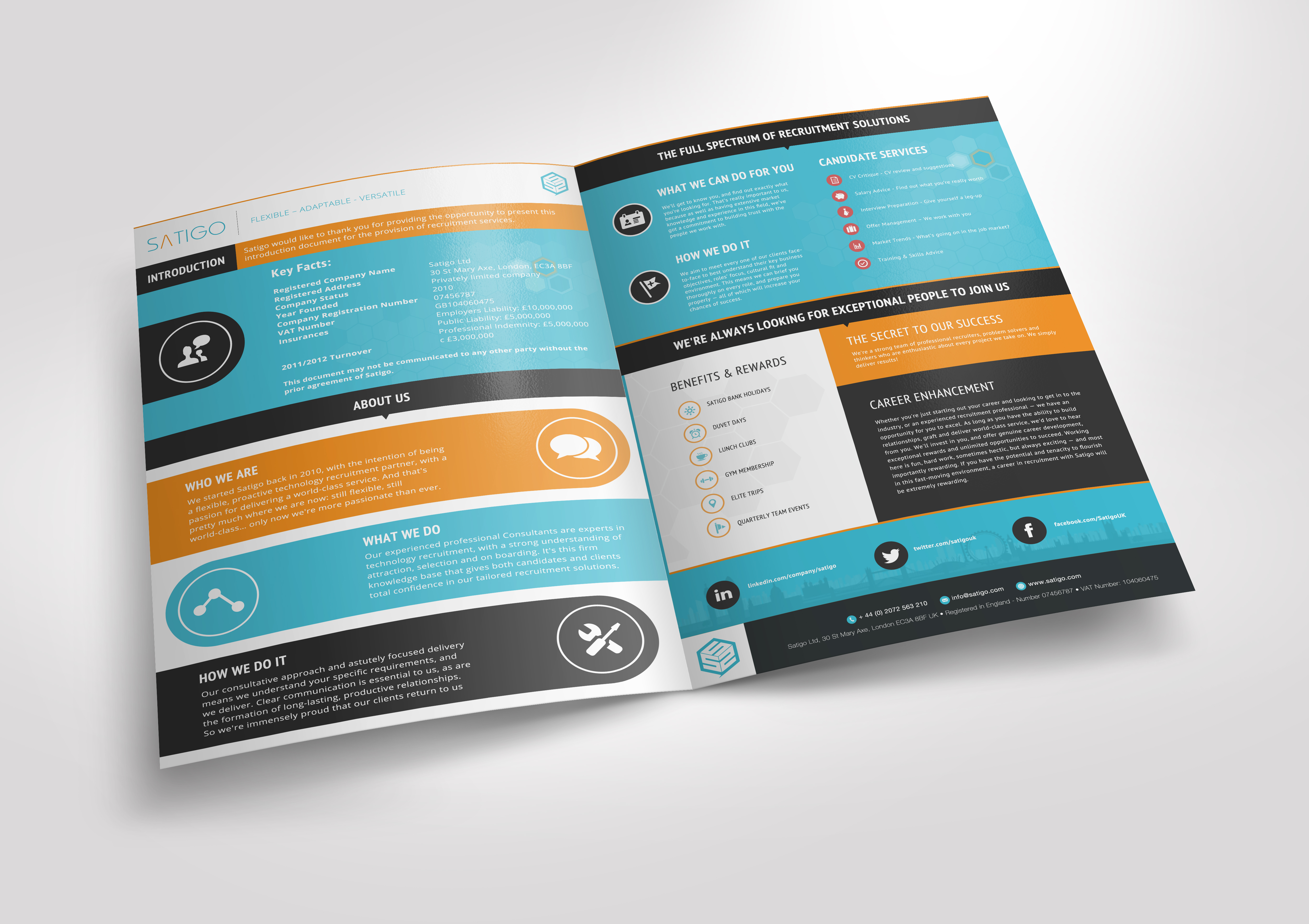
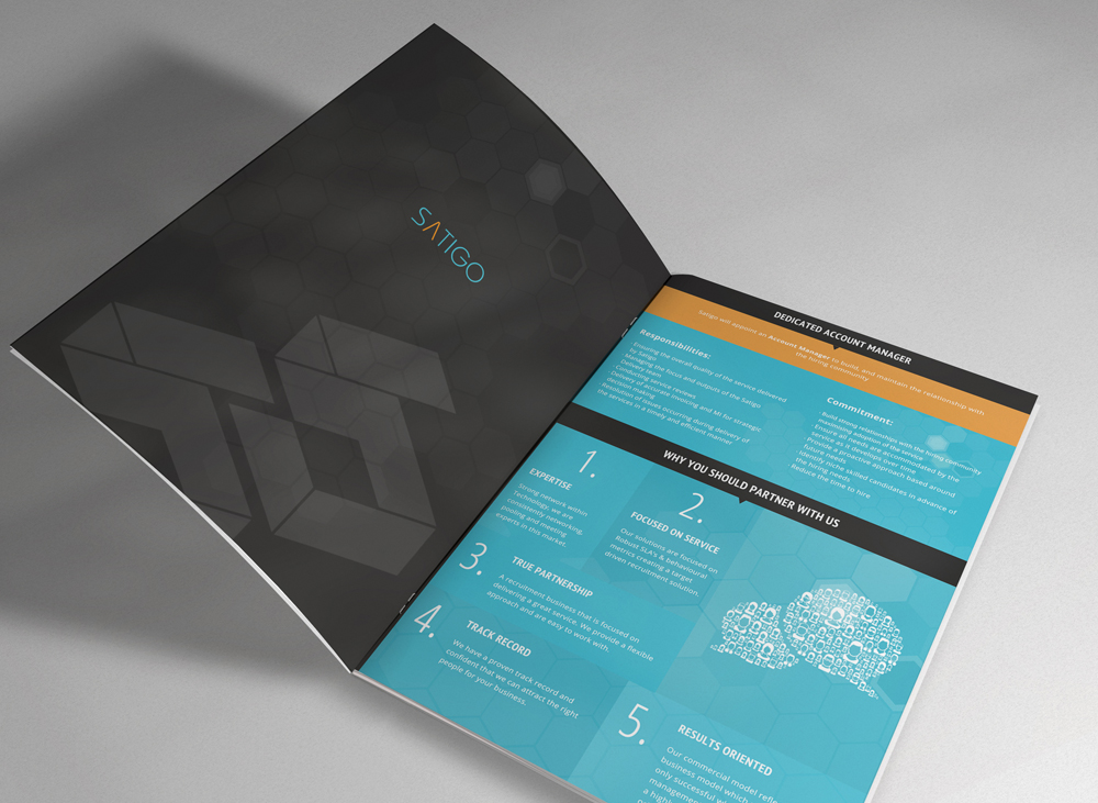
Reinvigorating an entire brand seemed daunting at first as there is no right or wrong solution. The output is very subjective and there can be countless revisions due to a lack of direction. Thankfully the survey narrowed down the requirements and provided me with a somewhat clear path to investigate. The logo and mark had to be recognisable in black and white, small and large and on web and print.
I was provided with examples of what my client saw as inspiration for the website. I took into account the keywords that were being described during our meeting to help with the direction. Words included modern, fresh, different, loud, one-pager, visual and not too text heavy. Defining which target audience to design for turned out to be quite a challenge as there was a clash between modern (candidates) and traditional (companies) styles. I had to ensure that both were being catered for. The website had to be fully responsive and work on all modern browsers.
The requirements for the dashboard were fairly specific as the sole purpose was to make it easy for my client to glance at the real-time sales statistics on a TV monitor instead of staring at rows and columns in a spreadsheet. So that meant the style of the dashboard had to be obvious, easy to digest and predictable. The dashboard also had to be fully responsive and work across all modern browsers.

My client iterated that the brand should reflect Satigo’s mission of being a leader in recruitment. The logo and mark was to stand out and move away from the generic recruitment stereotype.
My process consisted of plenty of sketching, constant communication and many iterations. My intention was to get out as many ideas as possible, even if they did seem rough or wild! This left more room for experimentation. I used Illustrator and explored complimentary colour palettes. I mixed and matched colours that felt electric and finally settled on blue and orange. I would present my work for feedback, even if it was unfinished and then iterated as necessary. Rapid prototyping helped me get closer to the goal much faster.
Eventually we settled for an abstract mark that was bold, strong and dimensional. The simplicity of the design allows the mark to be easily positioned on the web regardless of whether it’s a social media icon, favicon, grayscale overlay or print such as signage, business cards, t-shirts and brochures. I finalised the assets in Illustrator and then the vector artwork was sent to the printers.
The marketing site had to communicate to both audiences – companies looking to hire and candidates available for hire. I had plenty of direction derived from the branding task so I knew roughly to approach the design.
I began sketching out wireframes that demonstrated the architecture and hierarchy of the information and overall layout of the one-pager. The brand colours were included along with the logotype. The copy was supplied by a copywriter so I had real data to play with.
Once the wireframes were approved, I then moved on to the high fidelity mockup. I approached the design mobile first as I could focus on the essentials without bloating the site with unnecessary visuals. Part of my task was to design the site similar to an infographic as opposed to a generic about us site. The font used was clear, bold and craved attention.
After the mockup was approved, I then began developing the site based on a static template that was recommended by my client. I had to convert the site to WordPress as a real-time ticker was required to display the latest jobs from the MySQL database. I adapted the template using HTML, CSS, jQuery, PHP and MySQL to fit the new design and ensured that it was cross browser compatible and fully responsive through testing.
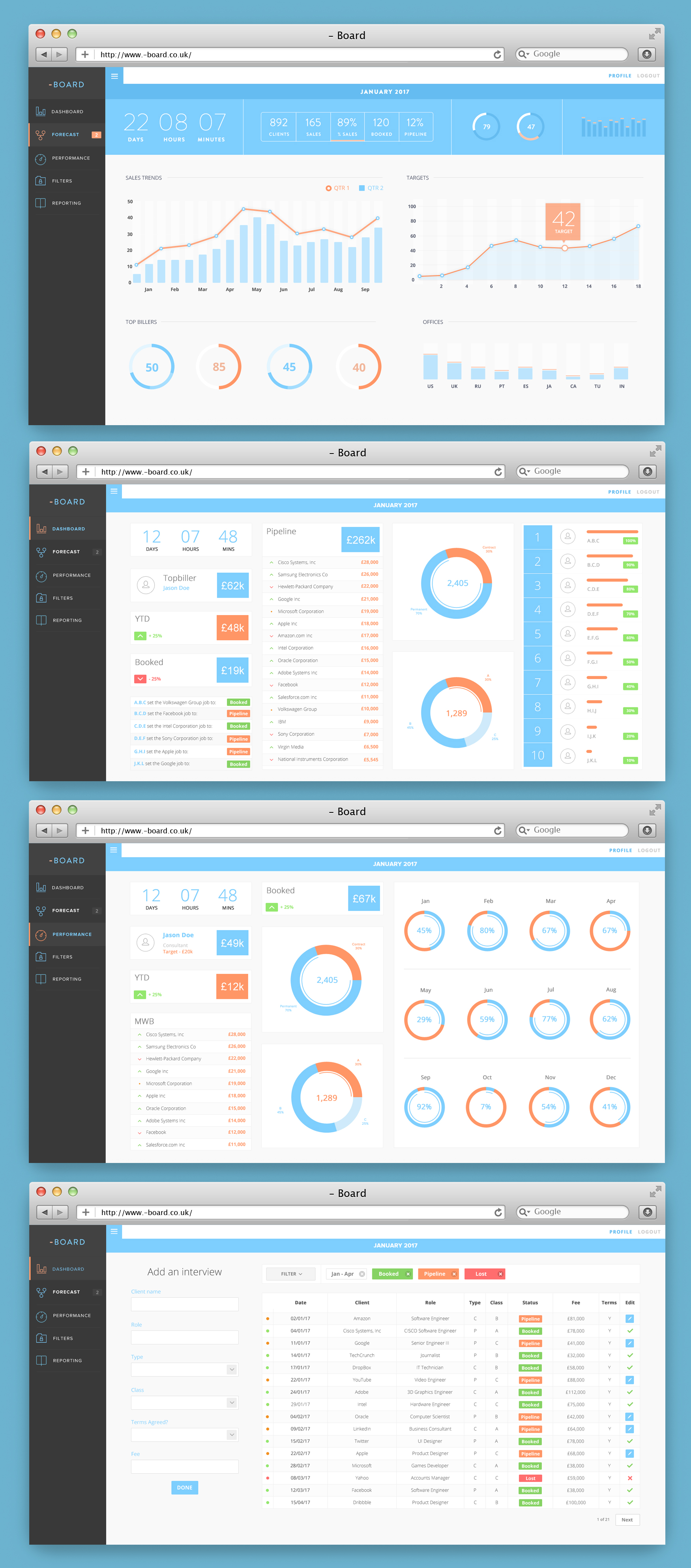
I was tasked with transforming a large Excel spreadsheet into a real-time, interactive dashboard for the web. I gathered the requirements from my client through online and onsite meetings. The meetings consisted of presenting wireframes and deciding on the most appropriate chart to display every piece of sales data.
Once the wireframes were approved after many iterations, the high-fidelity mockups were designed. This step went rather swiftly as the dashboard is much more content-focused. I used flat design to keep the style simple and on-brand.
The design of the dashboard consisted of a sidebar for easy navigation access and a main content area for displaying the sales data represented by charts. Visuals are much more easier to digest than raw tabular data so a lot of pie charts, line and bar graphs can be seen across the app. The design of the sales form was important as that is what drives the dashboard. The limited amount of fields were carefully chosen in order to reduce cognitive load.

The project was challenging, yet rewarding. I managed to develop some new skills and I also had the opportunity to push myself personally as well as professionally. My client (as well as his team) was very satisfied with the results and based on what I’ve been told, the project has helped them reach their goals of attracting new leads.
