Apply a visual design to multiple surfaces –
Demonstrate how you can apply a common visual language for a NASA time travel app, which consists of a UI that identifies where in time you are, where in time you want to go, and an actionable affordance to initiate time travel (don’t worry about flows). Provide a screen for both an iOS phone and an Android tablet that are on brand, while also being considerate of native platform design guidelines.
I’ve been tasked by the design team at Google to undertake a conceptual brief to envision time travel in the modern era. I’ll be employing an iterative design process in order to break down the requirements and fulfil the needs of the user.
Envisioning such an open-ended project within a restricted timeframe required me to make some assumptions along the way in order to limit the scope, maximise my focus and deliver on time. I’ll be approaching this problem the same way as I would with a freelance client.
Time Travel is not currently possible in this day and age. The definition can vary depending on who you ask. Some would say that we are already time travelling, but only into the future as time moves only in one direction. But the majority would argue that it is only theoretical as there is no shred of evidence to suggest that the 4th dimension can be reached. So researching existing real-world apps or asking experienced users about what it is like to time travel was impractical.
The perception of time travel has been glorified thanks to movies such as Interstellar, Back to the Future and Terminator. Drifting through wormholes and driving a hybrid space-car whilst ending up exposed on the other side is what we have been led to believe.
My intention was to envision what it is like to travel through time in the real world based on how we currently interact with our devices and our environment.
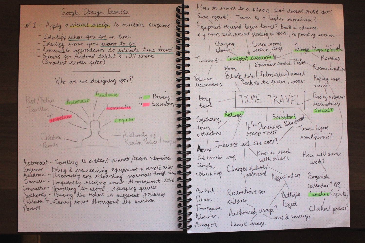
Time travelling describes the concept of going from point A, to point B in spacetime (past and future). I won’t be concerned about the mechanics of how the user is teleported whether it’s through a wormhole or by dispersing their atoms and then amassing it at the end. I’ll be focusing more on the actions that will allow the user to identify their current location, discover new locations and initiate an expedition. Before I can determine the features of the app, I’ll need to first identify what the user’s intentions are.


The ultimate goal of this design exercise is to provide me with an opportunity to demonstrate my visual design skills, so I’ll assume that the app is stand-alone. This is so that I have flexibility in making design decisions.
As there are so many different applications for time travel, I had to narrow down the scope and generate tasks so that I can begin executing efficiently. Even though the user is fictional, I can still research existing apps resembling the core components of time travelling. This also prevents me from reinventing the wheel by creating an alien interface which nobody understands.
Examples of similar core components include a:
Space travel is the most obvious for this user case. Visiting distance planets throughout space and time, reliving/correcting the past and seeing what the future holds is what most of us would predict. The user could be a holidaymaker looking for adventure and to explore human existence throughout distant galaxies. The UI requirements for this scenario would resemble user-friendly apps similar to booking a flight, hotel or vehicle. Features would include open sharing of content and relationship management, something that would resemble a social networking app in todays age.
Most of the problems that we face today can be traced back to the past. Through observation, certain actions can be prevented in the future by unearthing similar patterns throughout history. A user in this case could be an engineer, politician, astronaut or a military personal restoring order, maintaining equipments, exploring new territory and shaping a new world. The UI for this scenario would require maximum security and privacy, focusing less on sharing and strict relationship management.
Academics could travel back in time to discover what really happened before time began, how life unfolded and if there’s any evidence of extraterrestrial life. A UI for this scenario would focus more on sharing, learning and a friendly interface for all ages.
Before I could begin defining the user stories, I’d first have to realise my own vision of how time travel would function in reality. Some of my concerns that emerged during the analysis stage included questions such as:
I attempted to implement some safety measures to prevent the leakage of edge cases when defining the user stories.
After careful consideration, I eventually settled on designing an app aimed at the tourism industry.
I began preparing a list of tasks that will help me to define the scope, systems, actions and features required. So as a spectating traveller, I can:
With the problem provided, it’s easy to assume that only 3 screens are required. But based on my experience, a single screen can consist of many components such as hidden states, off-canvas elements, feedback, transitions and visual cues. I’ll have to determine the best path by thinking of these components as separate systems. Each will have their own function and not be dependant upon each other.
After I explored the possibilities of time travel using a mind map, I began sketch the solution based on the user stories and research conducted earlier. I now had a framework in which I could determine the optimal solutions for each task. I wanted the app to have a social aspect to it so I explored different ways of discovering content and connecting with fellow travellers.
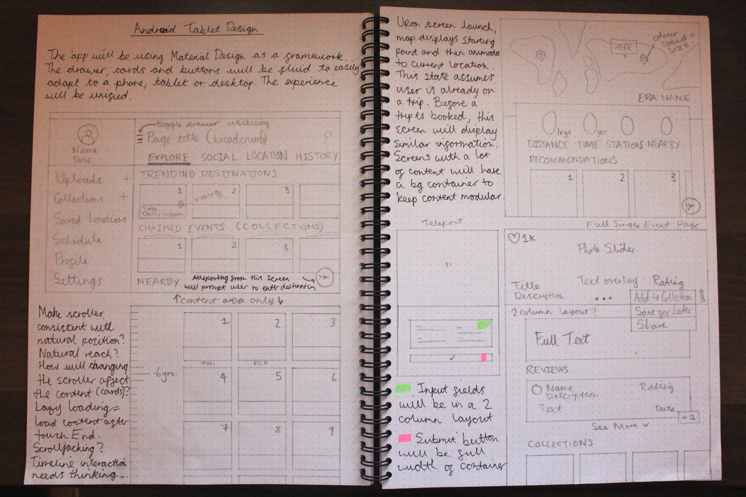
Earlier during the process I knew that I would be using a framework to help resolve common UX and UI issues. I chose Material Design as I’m not only a fan, but believe it makes me think about the structure of the navigation and layout more holistically before I dive into the UI. I knew in advance that the style may differ as I begin to incorporate the NASA branding and my own style further along the process.
I took into account the different platforms required and always begin with designing for the smallest screen first. Using Material Design provides a fluid and unified experience regardless of the device used and the amount of real estate available.

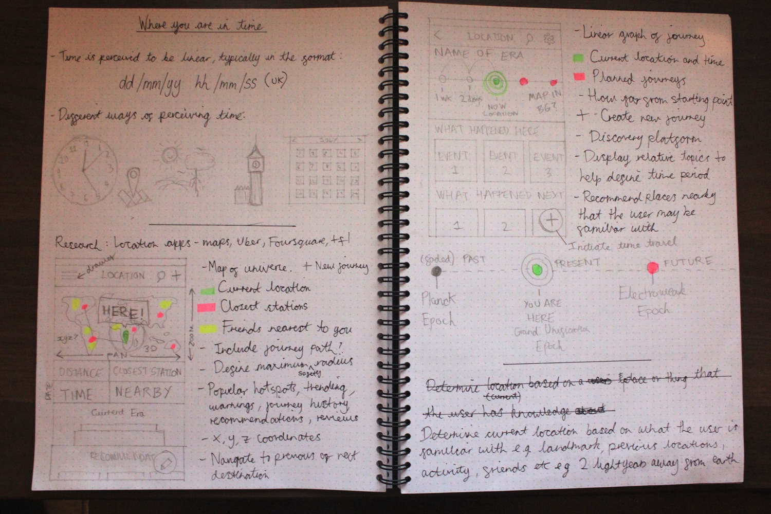
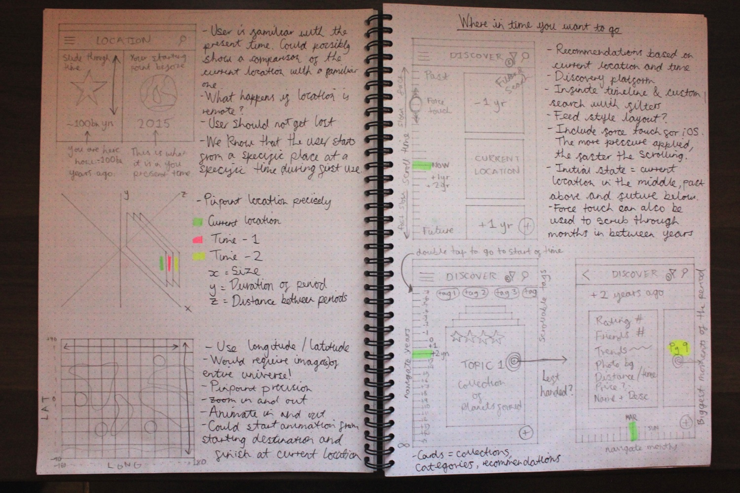
I first explored pinpointing a location in 3D space using long/lat coordinates on a standard map interface which a user should be familiar with. I also explored a timeline interface as there could be a possibility where the user will start from a specific point in time and then move onto multiple destinations. Determining a location can also be achieved by using a comparison between the start and end points. The start point is familiar to the user so then distance travelled in space can be easily calculated using celestial coordinates. An animation of moving from point A to B could also assist in reassuring the user where they are in space and time.
I eventually chose the standard animated map approach to determine the location of the user. This is because I believe that the UI will be more familiar and faster to digest. For this to work, there needs to be a map of the entire universe from every point in time. Of course this sounds impractical but if you have one image of the universe, then you can go back or forward in time to capture every state.
I conducted some research and found quite a few ways in which this is loosely being done. Google Sky[3] and Google Earth[4] are some examples. An artist also created a logarithmic map[5] of the universe based on the findings from researchers at Princeton University.
There were many calendars used before the introduction of the Gregorian calendar dating back to the 15th century. So which one is most suitable for determining the date and time? Will the calendar be suitable for travelling before the concept of time? What about on mars when days are longer? I decided to keep it simple and implement what the user is already familiar with by using n time ago.

There are many possibilities to exploring content and quite a few design patterns already exist to achieve this e.g. Google Now, Google Play, Airbnb and Dribbble. I experimented with using a vertical timeline scroller where the user can scroll and explore the most defining moments of the time period. In terms of the scrolling interaction, I could potentially take advantage of the force touch feature on iOS and Android. By pressing harder near the top or bottom of the screen, the content will scroll faster based on the relative position. I noticed some drawbacks to this interface as the spacing between lines will have to be adjacent to each card and there may be a case of scroll hijacking. This could make scrolling tedious. Also the cards are organised by time, making the purpose of discovery quite limiting.
I settled with using a card based layout as the content will be easy to consume and adapt to any screen size. Each card contains a single piece of information which is organised around the concept of an event in time. Cards can be categorised into any set or collection and still retain its form. With the addition of friends, the user can explore engaging content based on recommendations and what is currently trending. I’ve also incorporated a review feature to aid in decision making and a safety warning for distant travellers.
Inside each card contains content about the event, beautiful imagery, social aspects such as who’s been there and how many liked it, safety alerts and a location on a map. Also included are associated collections. A collection is a group of events that a user can travel through. For example, you can decide to travel through the life of a famous person or experience a chain of events that unfolded over time.

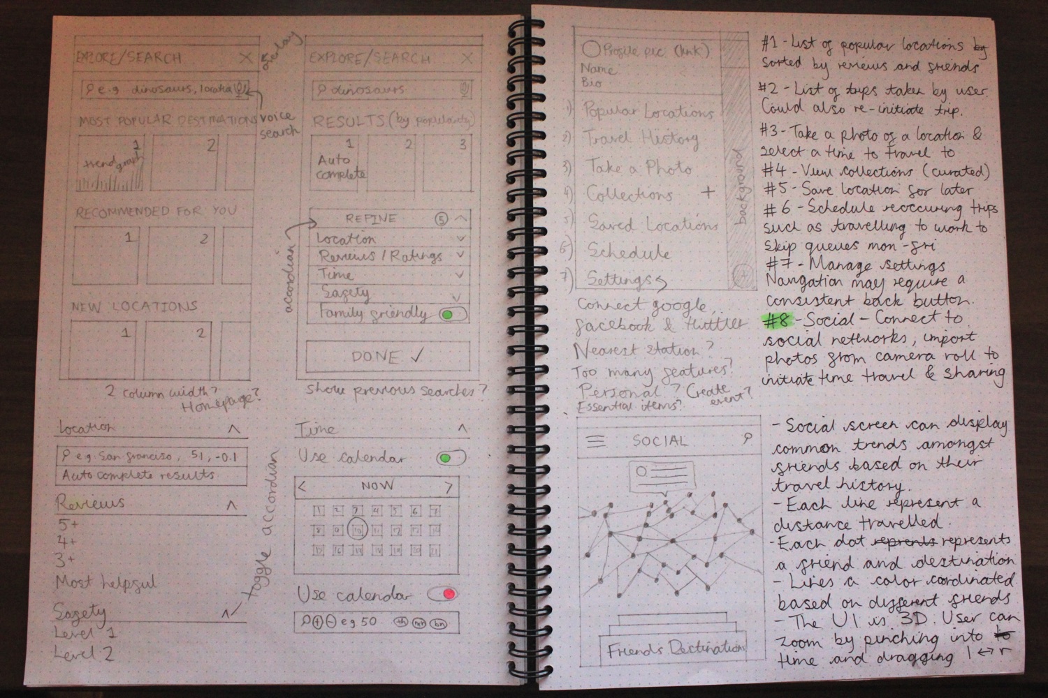
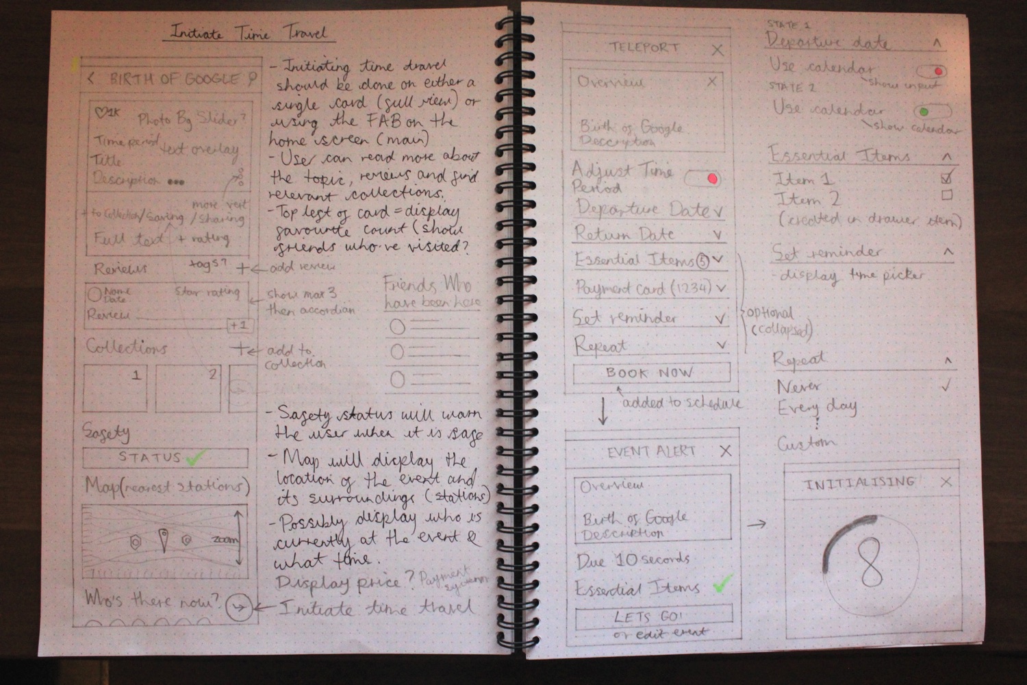
Initially I didn’t want the interface to be difficult to use and consist of a long form which the user will have to fill out every time they want to travel. As initiating time travel is the main feature, it deserves its own primary action. The floating action button is positioned on the main home screen and the action can also be found within the card itself. Before making a decision, information about the event will be displayed in order for the user to gain an insight into what the status is, what others think about it and alternative events.
Upon selecting the FAB, the user will be presented with a similar screen to the single card. Here they’ll be able to define their own or search for an existing event. The user is allowed to toggle between an n time ago input field or a calendar view for determining the time period to select. This screen will be familiar to those who’ve already used a calendar app before. A departure and return date must be specified (current time by default) and essential items such as medication must be ticked off before initialisation. There is also a payment method provided and an option to set a reminder before the event takes place. Finally recurring events can be set to repeat.
As my design process tends to be iterative, I noticed a few drawbacks with the sketches and decided to improve upon the UX and move onto high-fidelity wireframes. Certain issues included inconsistent navigation and inaccurately positioned/missing elements.
I wanted to introduce tabs in order to group the content much more efficiently. The hi-fidelity wireframes enabled me to think more critically about the content, its alignment and architecture. I also referred to Google’s Material Design[6] as a reference for layout.

Inspired by the Material Design framework, I debated on the best approach to seamlessly incorporate NASA’s brand guidelines. As the design of the app had to be on-brand, I used Helvetica as the main body font and Roboto for the condensed numbers. The colours used including various shades of blue, red and black were also on-brand.

The background was designed to be used alongside a parallax effect where low-poly elements would move subtly as the user scrolls up, down, left and right. The dark tone makes the content more prominent and compliments the bright colours and imagery.


The overall tone of the app is dark and futuristic. I wanted to explore what my version of the future will be when time travel is the norm. I believe that the theme is consistent with current NASA apps available in the market today.
Content including forms, popovers and full text areas are the only elements with a white background. This is to ensure that content is easy to read and accessible.


The red accent colour is used for primary active states such as the FAB, submit buttons, input fields and toggle buttons (favourite, +1, calendar select). I decided to use the red over the blue for the primary action as it’s more prominent.
The blue blends too well into the theme so it’s used as a secondary colour for less used elements such as active drawer icons and the calendar background.
The colours for the form elements uses a soft shade of blue for the default state. Some elements such as the search, filter, calendar icons have an active state where the opacity is reduced. This is to prevent conflict between the primary actions on a screen.
The cards were designed to include compact information about an event. Each card has a fixed size for responsiveness and contains an enticing hero image, title, time period, rating and monthly trend. The colours used are vibrant and based on the most prominent colour within the hero image.


Transforming the mobile mockups to a tablet was fairly simple thanks to the Material Design guidelines. Using cards made adjusting the content seamless as the size remained consistent. The drawer was collapsable and could also remain fixed for faster access to different sections.
As I was having a lot of fun working on this design exercise, I included additional features that I believe would be useful if time travel were possible.
The user can scroll through the most defining events of the year using the infinite timeline scroller. Pressing harder at the top or bottom will make the collection of cards scroll faster. Selecting a collection will display a horizontal timeline where the user can scroll left or right to display the most defining events of each month.
The user can search through their friends travel timeline and discover new events. The timelines can be scrolled left or right to view the start and current/end points. Pinching in and out will display the timelines of the friends who have previously travelled and are travelling now respectively.
A lot of our lives are spent waiting in queues. Taking advantage of the daily commute will allow us to get to work in an instant. The user can schedule frequent trips to avoid the grind.
I included a feature named Upload that can be found in the drawer. This feature would allow the user to take a photo of an object or a moment, and then review the past and future versions through a timeline interface.

If I could travel back in time, I would like to have focused more on determining what each screen would look like with different states such as preloading, empty, filled, overflowing and inactive. It would have also been great to spend more time refining the visual elements as exploring futuristic concepts was rather fun!