Calipsa
I worked alongside the CEO of Calipsa (who is also one of my university friends) developing the UI for an AI surveillance platform. You can learn more about what they do at calipsa.io.
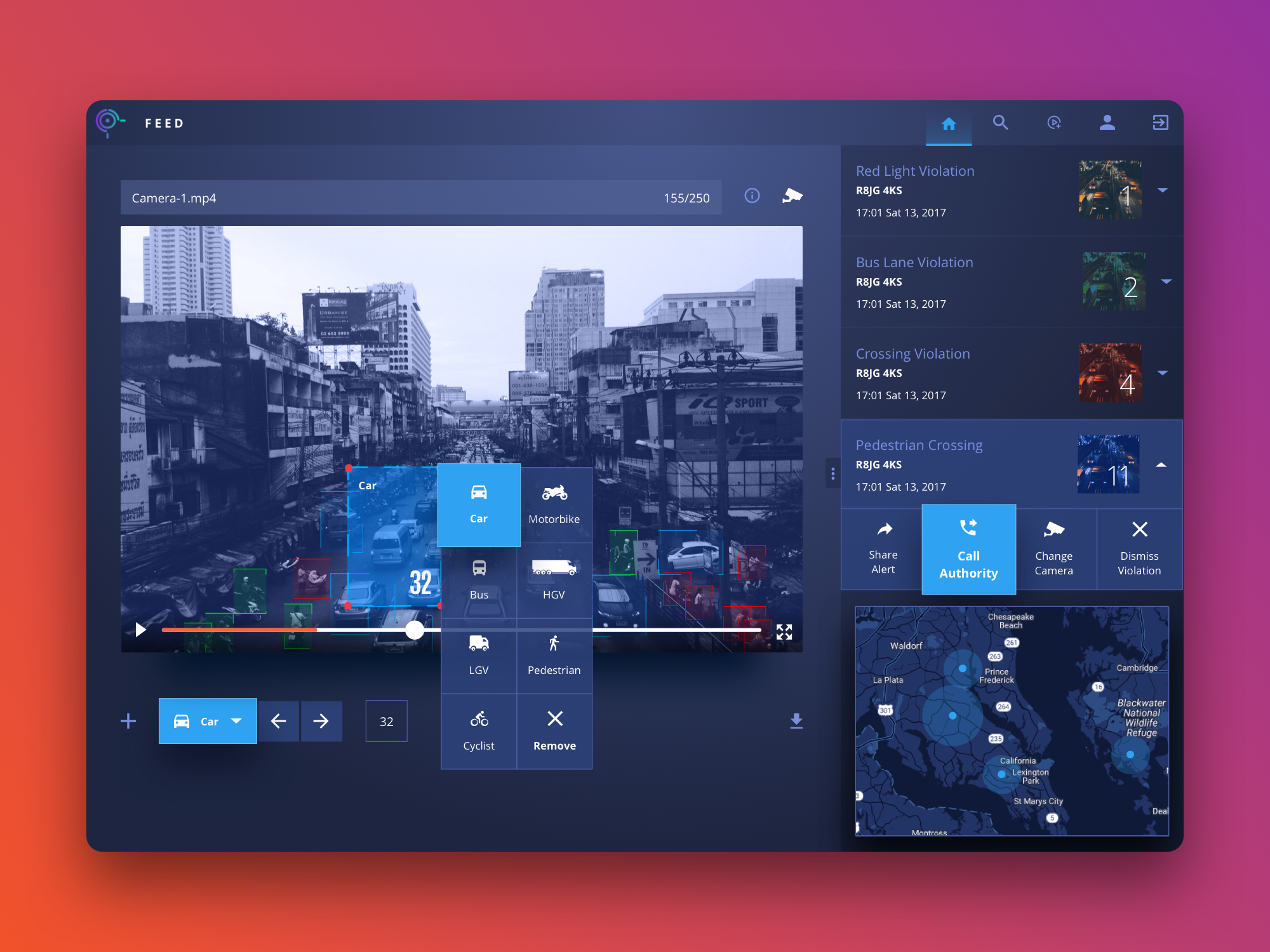
I worked alongside the CEO of Calipsa (who is also one of my university friends) developing the UI for an AI surveillance platform. You can learn more about what they do at calipsa.io.

Fitness Class Leaderboard –
For exercises that generate real-time performance data (e.g. distance, calories burned, repetitions), many fitness classes encourage friendly competition through a digital leaderboard visible to their students for the duration of a session.
Design a two-screen experience including a large television display for the leaderboard and a simple smartphone app for agreeing to participate and choosing a public identity. Provide high-fidelity mocks for each of these screens.
I have been tasked by Google to design a digital leaderboard that generates real-time performance data. The product will be displayed on a large TV monitor along with a standalone Android app to allow students to participate in the exercises.
I’ll be loosely following the Design Sprint methodology as it provides me with a framework for tackling the design challenge.
Due to the nature of the exercise, a few assumptions have been made along the way to cover edge cases and to tackle the challenge within the given time frame and resources.
I assume that the gym contains the latest equipment installed with smart technology that is capable of tracking the performance of the student. The leaderboard will consist of an app connected to the cloud from a server and displayed via a large TV. The equipment will be connected to the server via wi-fi and the student performance data will be relayed to the cloud.
I assume that all students are grouped together by age range or ability to ensure that the sessions are as fair as possible. Each student owns a smartphones and has at least one social media account. A public identity is where a user uses their real name and photo of themselves. The app has the ability to record and store previous sessions of each user to monitor their progress over a certain period of time.
The TV is interactive and can also be controlled using a smartphone via the app. The hybrid app is responsive so it can easily adapt to a smaller or largeer display whilst providing a seamless experience. The instructor has admin privileges to control the sessions.
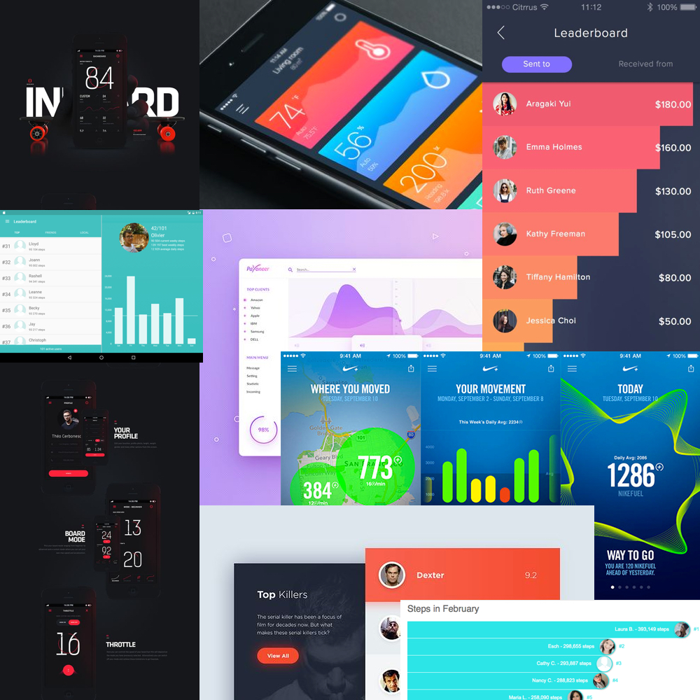
My first step to tackling the challenge was to understand the problem statement and who I was going to be designing for. I researched competitors including FitBit and Apple to gather an understanding of how they would approach the problem of ranking users in real-time. As this was a visual design exercise, I also observed their design language and overall aesthetic style. I wanted to build a mental model of how I can approach the problem from a different angle.
The majority of the interfaces I saw from my competitors employed a mixture of light and dark themes. The approach they took to displaying a leaderboard was fairly basic as the UI mainly consisted of standard tables and bar charts. The apps were mainly designed for desktop and mobile devices. Knowing that I was designing for a large TV, I had a lot more real estate to experiment with. TV screens differ from traditional computer screens as they tend to be much larger. The user is typically within a close proximity when using their devices and further away when watching TV so I had to take this into account when tackling the problem.
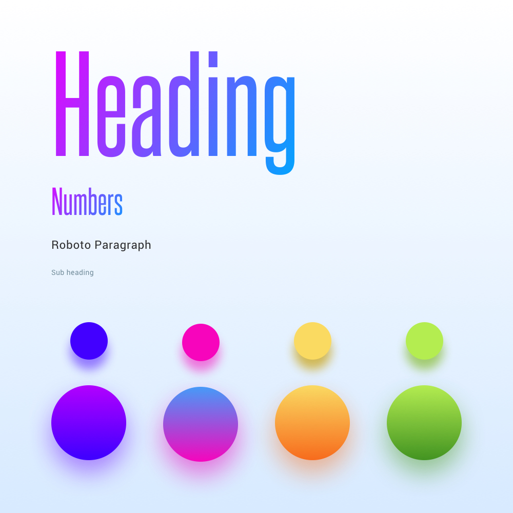
The condensed font I selected helped communicate limited content whilst saving real estate. Although they do have their downsides, I used it sparingly for headings only. The font was only applied to ‘quick-glance’ content such as the countdown timer and stats.
Roboto was used for the body content as it is a well crafted font and compliments the primary font very well.
The colours selected were electric, infused energy and fitted the tone well for a fitness app.
Defining the users was the first challenge upon identifying the problem statement. Focusing on the user’s needs and the problems that they are facing was my preferred approach before wireframing. I generated personas and user stories to define characteristics and attempted to mould a personality behind each user type. Making design decisions using this approach helped provide clearer direction as I attempted to understand their perspective. The user stories enabled me to grasp the higher order features required for the app.
Generating a mind map enabled to me gain a broader understanding of how the fitness industry is interconnected and also enabled me to gather my thoughts on paper. The mind map aided in providing me with a broader understanding of the problem at hand.
After I have defined the two different users (Instructor and Student) and their stories, I began generating wireframes. I created multiple variations of the same screen to explore news way of displaying the leaderboard and providing a way for the students to participate using the app. I wanted to create a consistent and unified experience regardless of the platform. As the leaderboard was to be displayed on a large TV (75″) and viewed from around 20 meters away, I had to ensure that the content was easy to read. Using large fonts and keeping the copy to a minimum was my main concern as the leaderboard’s purpose is to allow the students to ‘glance’ at their position intermittently.
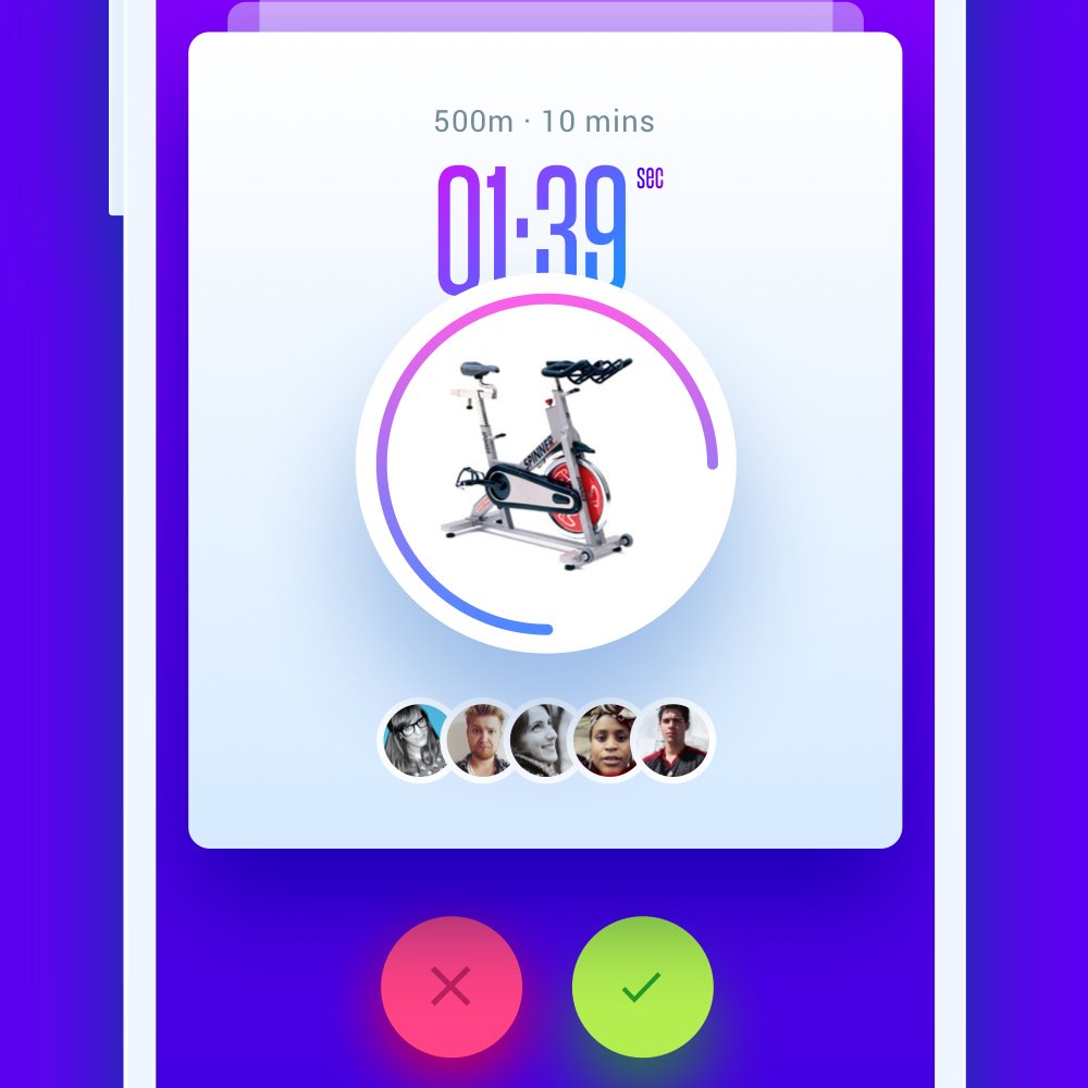
For the students, I wanted them to have a seamless and swift experience for using the app allowing them to select their public identity and participate in a session. The UX consists of the student logging into the app using a social media account and then viewing available session via close proximity (GPS). A simple swipe of a card will allow the student to either join or dismiss a session to their liking.
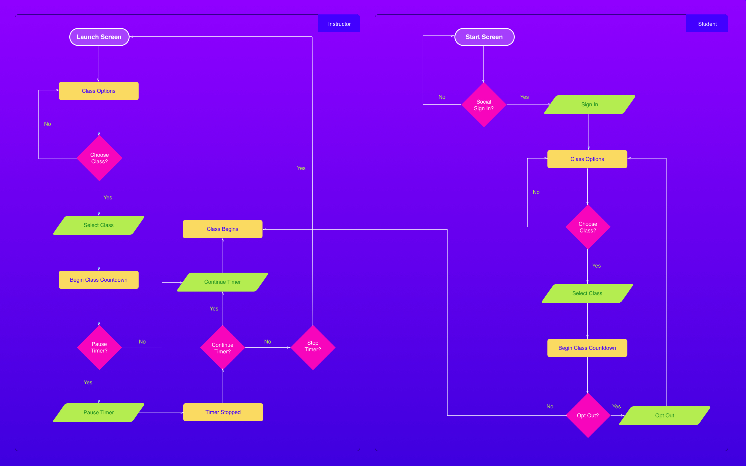
A user flow was created to understand the actions that either an Instructor or Student would take to complete a task. Seeing how they would interact with the interface from a first person perspective helped me to define the essential elements required and the flow of the application.
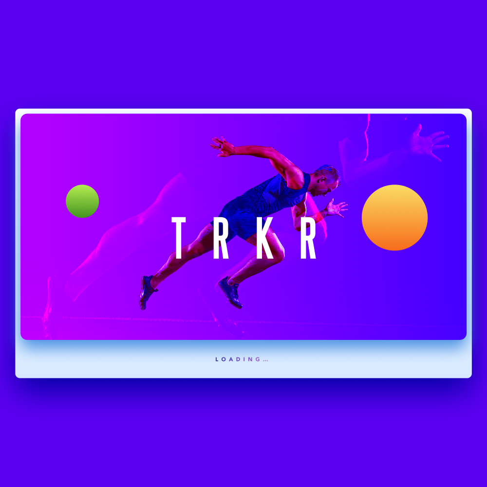
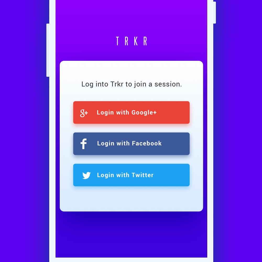
I also spent some time exploring the branding in terms of logo types and marks. I settled on Trkr (short for tracker) as I interpreted the word to represent performance tracking.
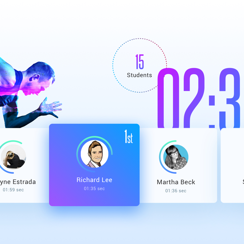
The overall visual style of Trkr is clean, minimal and energetic. I employed a combination of light and dark elements to provide balance.
The session countdown screen consists of a countdown timer along with the students who are participating in the session. One student card is highlighted as being the top performer of the class. The radial chart around the user’s profile photo demonstrates their progress for all the session combined in each class. The cards are horizontally scrollable and automatically rotate when new students join.
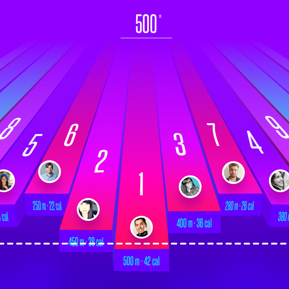
The leaderboard consists of a 3D interface using the z-axis to display the position of each student during a session. Using a standard bar chart was not challenging, too generic and I didn’t feel that it was the best experience for the user. I attempted to simulate a real race track by adjusting the perspective to appear as if the positions of the users are coming out of the screen. Each position is colour coded depending on a user’s position. The bar will turn red the closer the user is to the top (1st place) and the bar will turn blue, when they are near the bottom (15th place). If there are too many users to display for the limited real estate, then the leaderboard can rotate horizontally at regular time intervals. By default the UI will always center the 1st position. The bars move downwards as the y-axis represents time. Their current distance is displayed at the bottom of each bar and the dashed finish will determine the end of the session.
The mobile app is visually consistent with the leaderboard as it uses the z-axis and contains simple elements and no clutter.

Each component in the UI was crafted carefully and has its place to fulfil the user’s needs. Below is a breakdown of the specific elements in more detail.
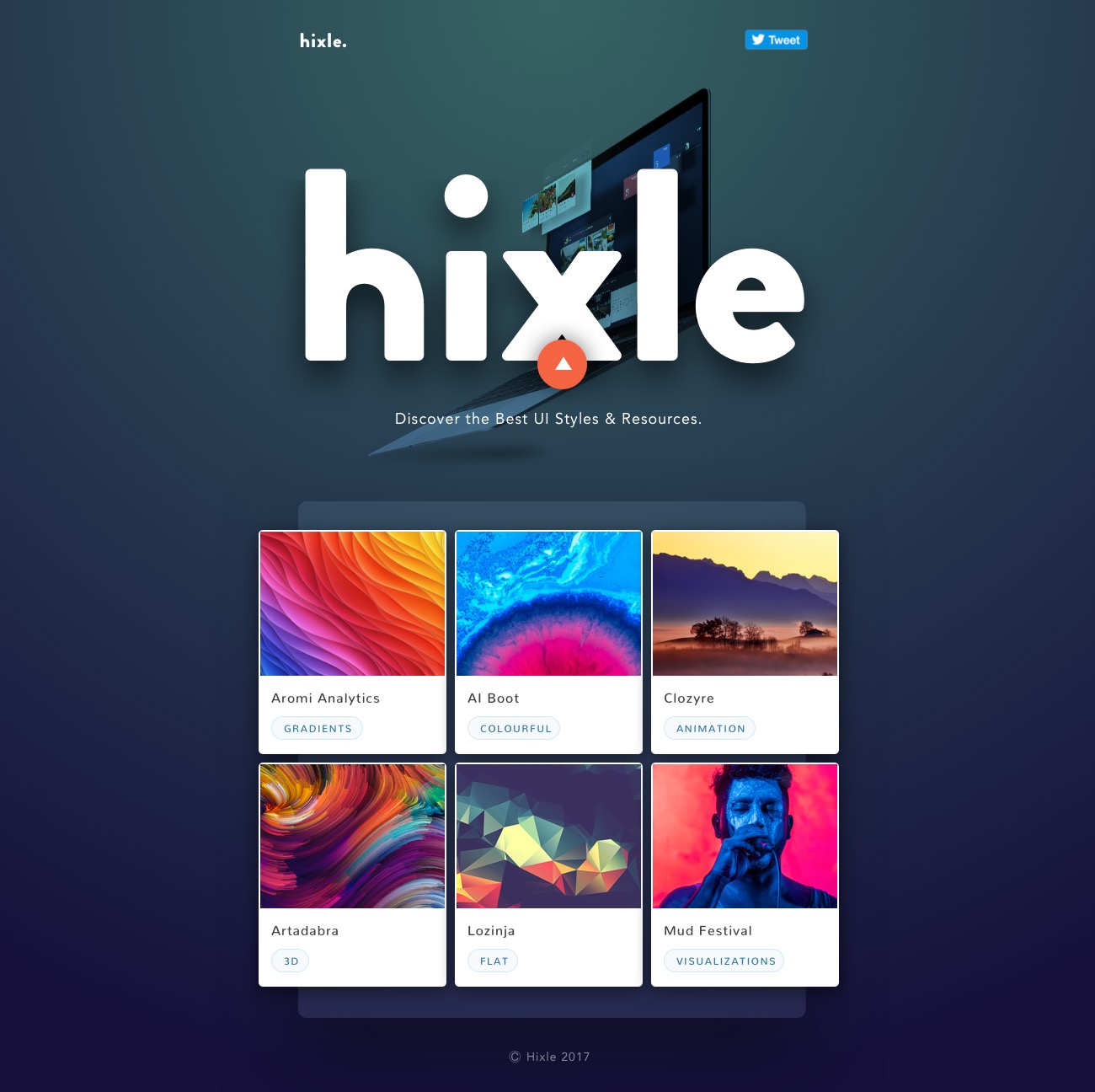
I’ve been working on a side project aimed towards designers. The app curates the latest design styles including colours, fonts and tools from the best designs around the web. These assets are the fundamental building blocks of visual design so it’s a great source of inspiration to have.
I’ve also been wanting to scratch my own itch and build something useful whilst bolstering my coding skills, so here I present to you….hixle.co!
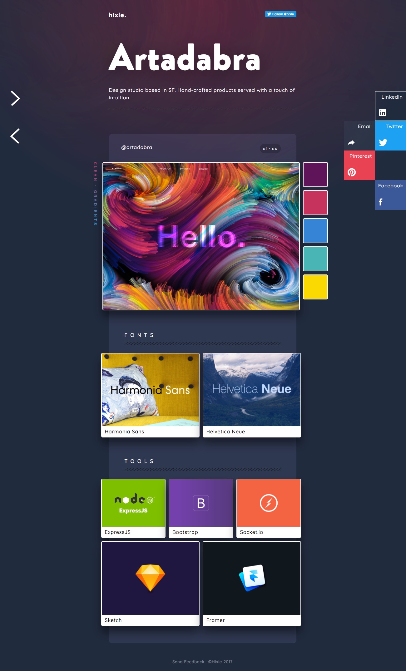

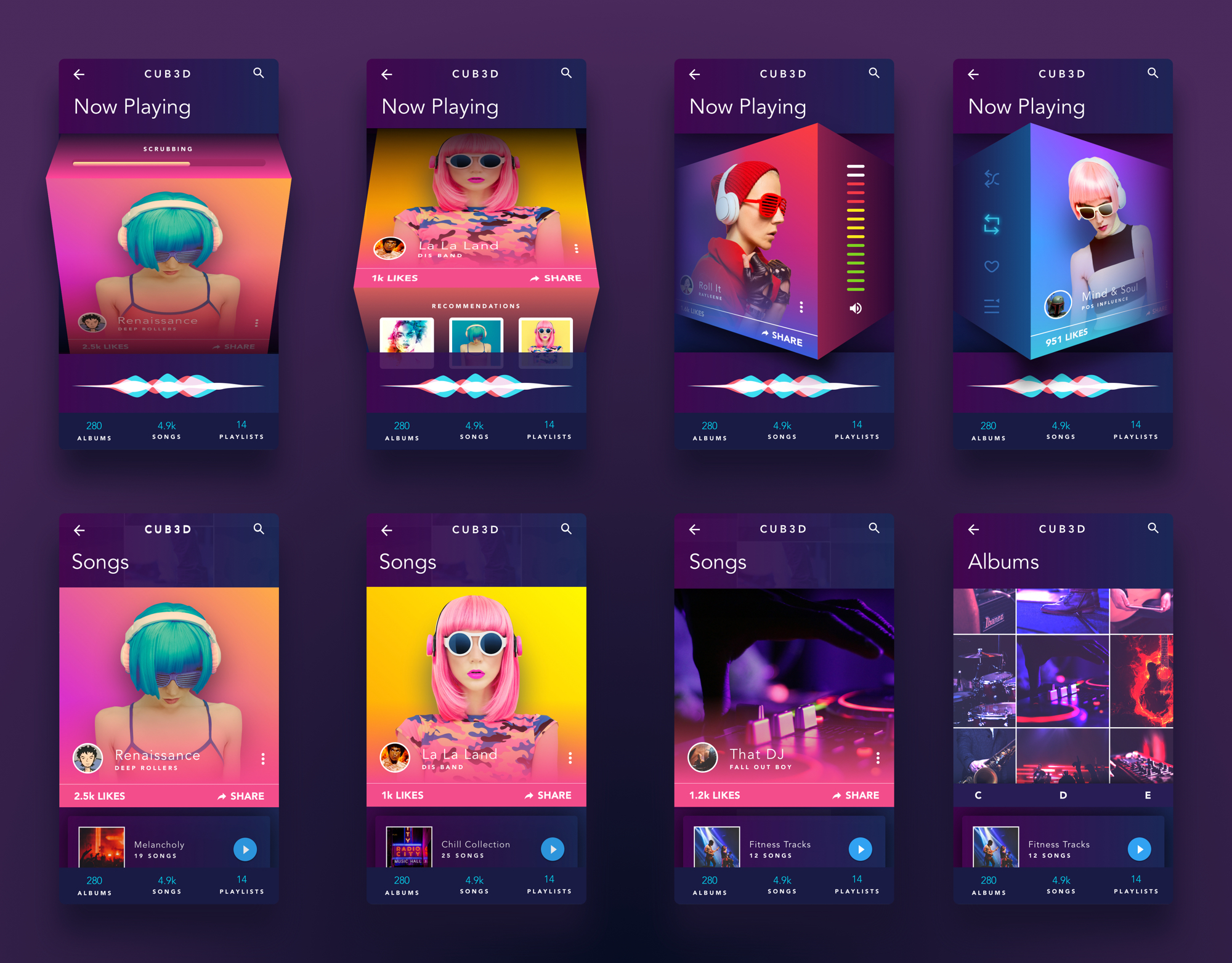
I’ve been playing around with 3D interactions & transitions as I’m really getting into VR UI design. It requires a different approach as demonstrating 3D depth and perspective can be a challenge in most design and prototyping tools.
I’ve been experimenting with new and unusual layouts & styles. The idea was to distribute content without restricting it’s size based on its container. The grid is flexible and can easily be adjusted from fixed-width to full-width. The content is modular and includes elements that float off the page.

Apply a visual design to multiple surfaces –
Demonstrate how you can apply a common visual language for a NASA time travel app, which consists of a UI that identifies where in time you are, where in time you want to go, and an actionable affordance to initiate time travel (don’t worry about flows). Provide a screen for both an iOS phone and an Android tablet that are on brand, while also being considerate of native platform design guidelines.
I’ve been tasked by the design team at Google to undertake a conceptual brief to envision time travel in the modern era. I’ll be employing an iterative design process in order to break down the requirements and fulfil the needs of the user.
Envisioning such an open-ended project within a restricted timeframe required me to make some assumptions along the way in order to limit the scope, maximise my focus and deliver on time. I’ll be approaching this problem the same way as I would with a freelance client.
Time Travel is not currently possible in this day and age. The definition can vary depending on who you ask. Some would say that we are already time travelling, but only into the future as time moves only in one direction. But the majority would argue that it is only theoretical as there is no shred of evidence to suggest that the 4th dimension can be reached. So researching existing real-world apps or asking experienced users about what it is like to time travel was impractical.
The perception of time travel has been glorified thanks to movies such as Interstellar, Back to the Future and Terminator. Drifting through wormholes and driving a hybrid space-car whilst ending up exposed on the other side is what we have been led to believe.
My intention was to envision what it is like to travel through time in the real world based on how we currently interact with our devices and our environment.
Time travelling describes the concept of going from point A, to point B in spacetime (past and future). I won’t be concerned about the mechanics of how the user is teleported whether it’s through a wormhole or by dispersing their atoms and then amassing it at the end. I’ll be focusing more on the actions that will allow the user to identify their current location, discover new locations and initiate an expedition. Before I can determine the features of the app, I’ll need to first identify what the user’s intentions are.
The ultimate goal of this design exercise is to provide me with an opportunity to demonstrate my visual design skills, so I’ll assume that the app is stand-alone. This is so that I have flexibility in making design decisions.
As there are so many different applications for time travel, I had to narrow down the scope and generate tasks so that I can begin executing efficiently. Even though the user is fictional, I can still research existing apps resembling the core components of time travelling. This also prevents me from reinventing the wheel by creating an alien interface which nobody understands.
Examples of similar core components include a:
Space travel is the most obvious for this user case. Visiting distance planets throughout space and time, reliving/correcting the past and seeing what the future holds is what most of us would predict. The user could be a holidaymaker looking for adventure and to explore human existence throughout distant galaxies. The UI requirements for this scenario would resemble user-friendly apps similar to booking a flight, hotel or vehicle. Features would include open sharing of content and relationship management, something that would resemble a social networking app in todays age.
Most of the problems that we face today can be traced back to the past. Through observation, certain actions can be prevented in the future by unearthing similar patterns throughout history. A user in this case could be an engineer, politician, astronaut or a military personal restoring order, maintaining equipments, exploring new territory and shaping a new world. The UI for this scenario would require maximum security and privacy, focusing less on sharing and strict relationship management.
Academics could travel back in time to discover what really happened before time began, how life unfolded and if there’s any evidence of extraterrestrial life. A UI for this scenario would focus more on sharing, learning and a friendly interface for all ages.
Before I could begin defining the user stories, I’d first have to realise my own vision of how time travel would function in reality. Some of my concerns that emerged during the analysis stage included questions such as:
I attempted to implement some safety measures to prevent the leakage of edge cases when defining the user stories.
After careful consideration, I eventually settled on designing an app aimed at the tourism industry.
I began preparing a list of tasks that will help me to define the scope, systems, actions and features required. So as a spectating traveller, I can:
With the problem provided, it’s easy to assume that only 3 screens are required. But based on my experience, a single screen can consist of many components such as hidden states, off-canvas elements, feedback, transitions and visual cues. I’ll have to determine the best path by thinking of these components as separate systems. Each will have their own function and not be dependant upon each other.
After I explored the possibilities of time travel using a mind map, I began sketch the solution based on the user stories and research conducted earlier. I now had a framework in which I could determine the optimal solutions for each task. I wanted the app to have a social aspect to it so I explored different ways of discovering content and connecting with fellow travellers.
Earlier during the process I knew that I would be using a framework to help resolve common UX and UI issues. I chose Material Design as I’m not only a fan, but believe it makes me think about the structure of the navigation and layout more holistically before I dive into the UI. I knew in advance that the style may differ as I begin to incorporate the NASA branding and my own style further along the process.
I took into account the different platforms required and always begin with designing for the smallest screen first. Using Material Design provides a fluid and unified experience regardless of the device used and the amount of real estate available.
I first explored pinpointing a location in 3D space using long/lat coordinates on a standard map interface which a user should be familiar with. I also explored a timeline interface as there could be a possibility where the user will start from a specific point in time and then move onto multiple destinations. Determining a location can also be achieved by using a comparison between the start and end points. The start point is familiar to the user so then distance travelled in space can be easily calculated using celestial coordinates. An animation of moving from point A to B could also assist in reassuring the user where they are in space and time.
I eventually chose the standard animated map approach to determine the location of the user. This is because I believe that the UI will be more familiar and faster to digest. For this to work, there needs to be a map of the entire universe from every point in time. Of course this sounds impractical but if you have one image of the universe, then you can go back or forward in time to capture every state.
I conducted some research and found quite a few ways in which this is loosely being done. Google Sky[3] and Google Earth[4] are some examples. An artist also created a logarithmic map[5] of the universe based on the findings from researchers at Princeton University.
There were many calendars used before the introduction of the Gregorian calendar dating back to the 15th century. So which one is most suitable for determining the date and time? Will the calendar be suitable for travelling before the concept of time? What about on mars when days are longer? I decided to keep it simple and implement what the user is already familiar with by using n time ago.
There are many possibilities to exploring content and quite a few design patterns already exist to achieve this e.g. Google Now, Google Play, Airbnb and Dribbble. I experimented with using a vertical timeline scroller where the user can scroll and explore the most defining moments of the time period. In terms of the scrolling interaction, I could potentially take advantage of the force touch feature on iOS and Android. By pressing harder near the top or bottom of the screen, the content will scroll faster based on the relative position. I noticed some drawbacks to this interface as the spacing between lines will have to be adjacent to each card and there may be a case of scroll hijacking. This could make scrolling tedious. Also the cards are organised by time, making the purpose of discovery quite limiting.
I settled with using a card based layout as the content will be easy to consume and adapt to any screen size. Each card contains a single piece of information which is organised around the concept of an event in time. Cards can be categorised into any set or collection and still retain its form. With the addition of friends, the user can explore engaging content based on recommendations and what is currently trending. I’ve also incorporated a review feature to aid in decision making and a safety warning for distant travellers.
Inside each card contains content about the event, beautiful imagery, social aspects such as who’s been there and how many liked it, safety alerts and a location on a map. Also included are associated collections. A collection is a group of events that a user can travel through. For example, you can decide to travel through the life of a famous person or experience a chain of events that unfolded over time.
Initially I didn’t want the interface to be difficult to use and consist of a long form which the user will have to fill out every time they want to travel. As initiating time travel is the main feature, it deserves its own primary action. The floating action button is positioned on the main home screen and the action can also be found within the card itself. Before making a decision, information about the event will be displayed in order for the user to gain an insight into what the status is, what others think about it and alternative events.
Upon selecting the FAB, the user will be presented with a similar screen to the single card. Here they’ll be able to define their own or search for an existing event. The user is allowed to toggle between an n time ago input field or a calendar view for determining the time period to select. This screen will be familiar to those who’ve already used a calendar app before. A departure and return date must be specified (current time by default) and essential items such as medication must be ticked off before initialisation. There is also a payment method provided and an option to set a reminder before the event takes place. Finally recurring events can be set to repeat.
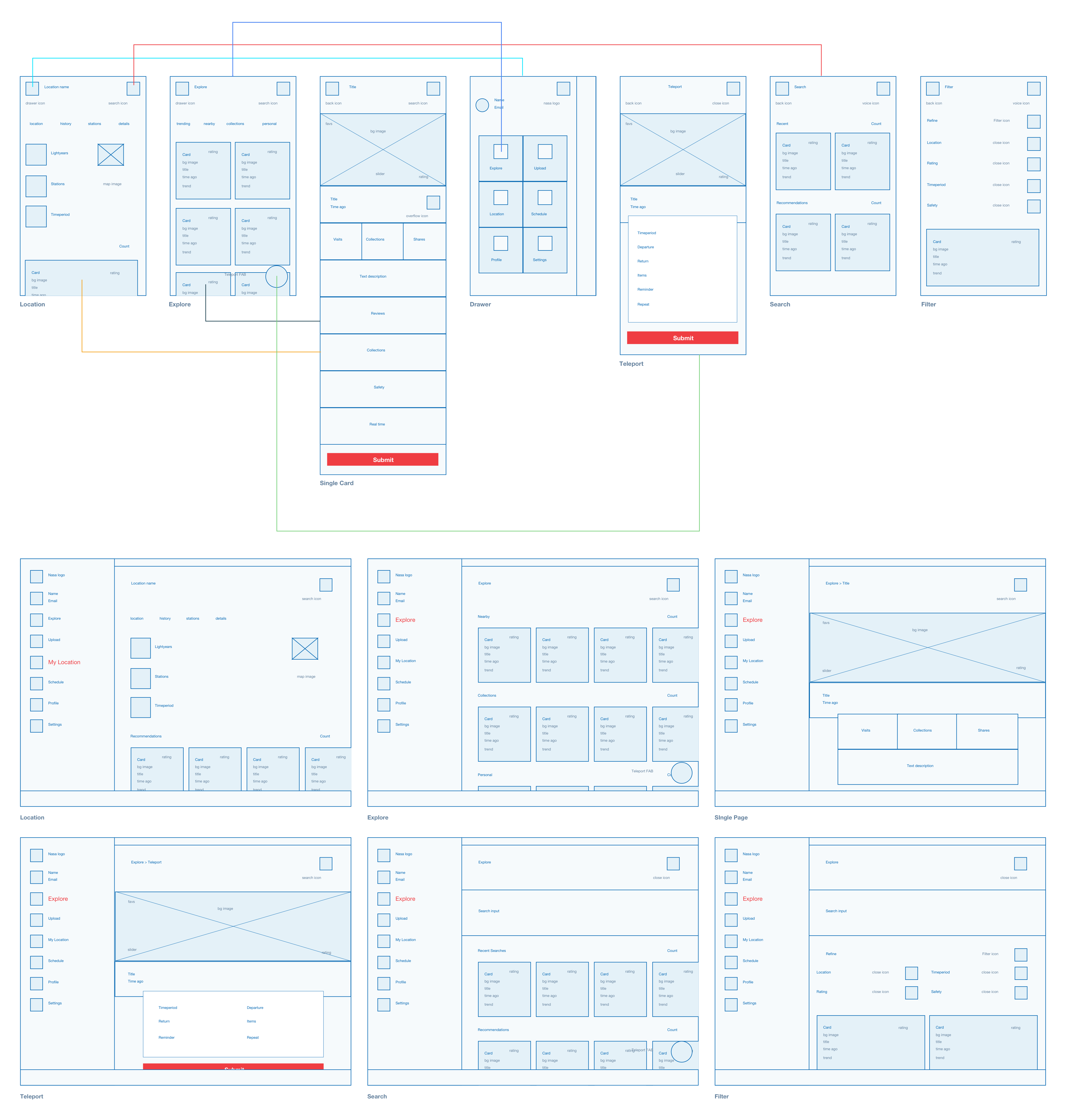
As my design process tends to be iterative, I noticed a few drawbacks with the sketches and decided to improve upon the UX and move onto high-fidelity wireframes. Certain issues included inconsistent navigation and inaccurately positioned/missing elements.
I wanted to introduce tabs in order to group the content much more efficiently. The hi-fidelity wireframes enabled me to think more critically about the content, its alignment and architecture. I also referred to Google’s Material Design[6] as a reference for layout.
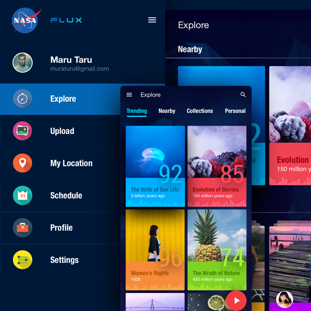
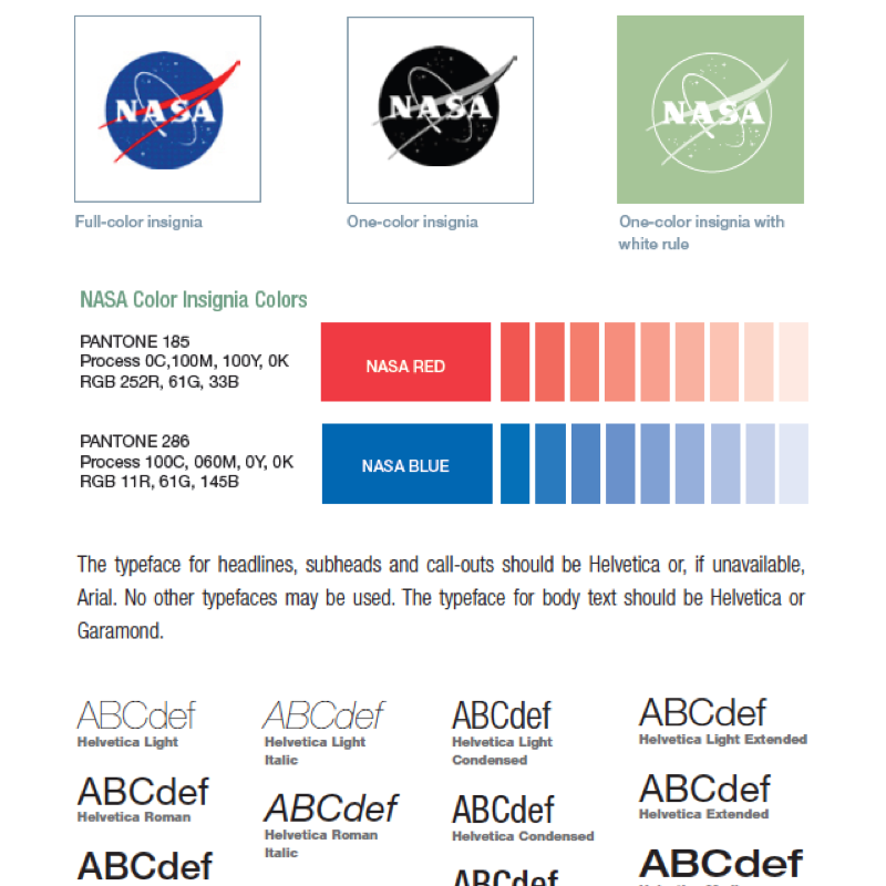
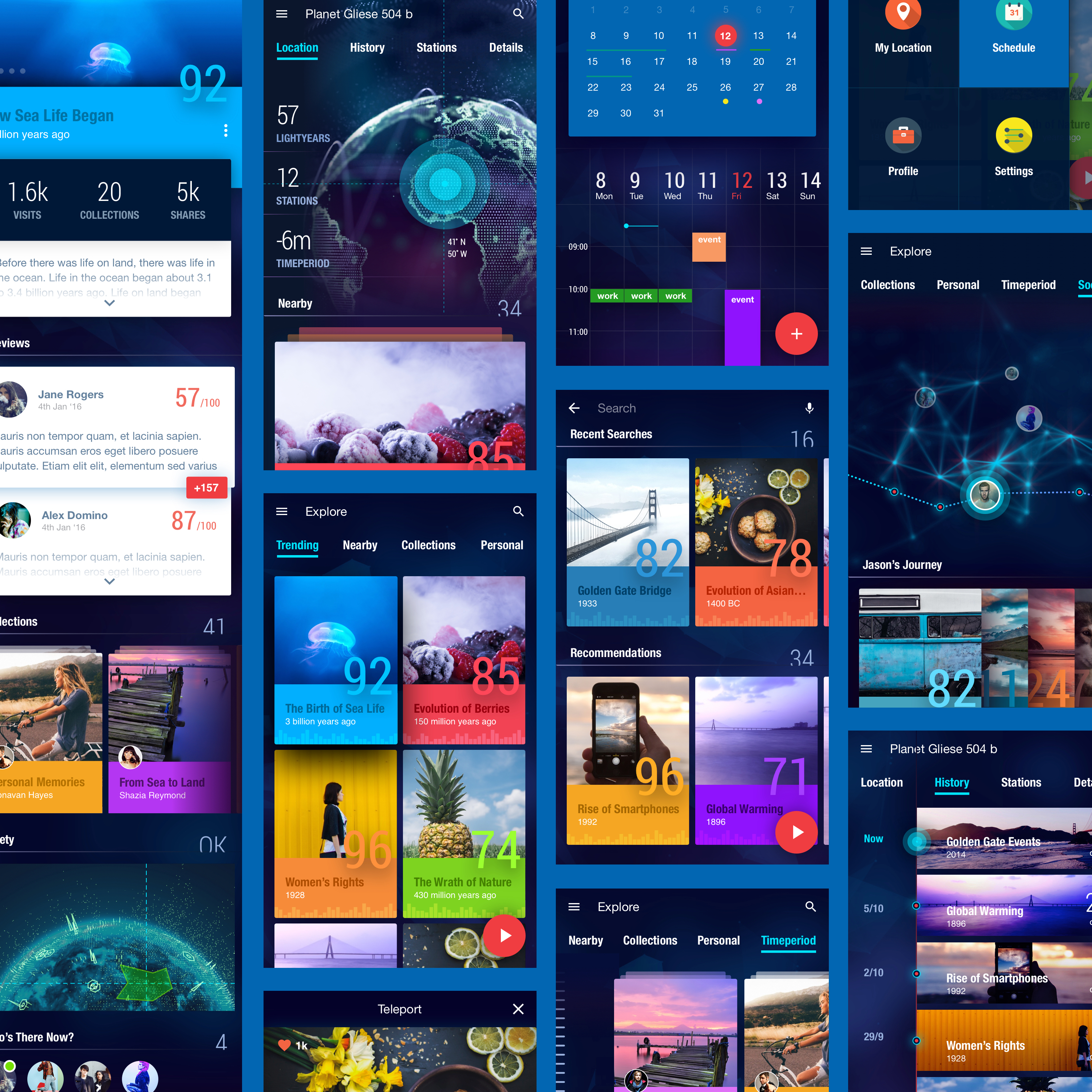
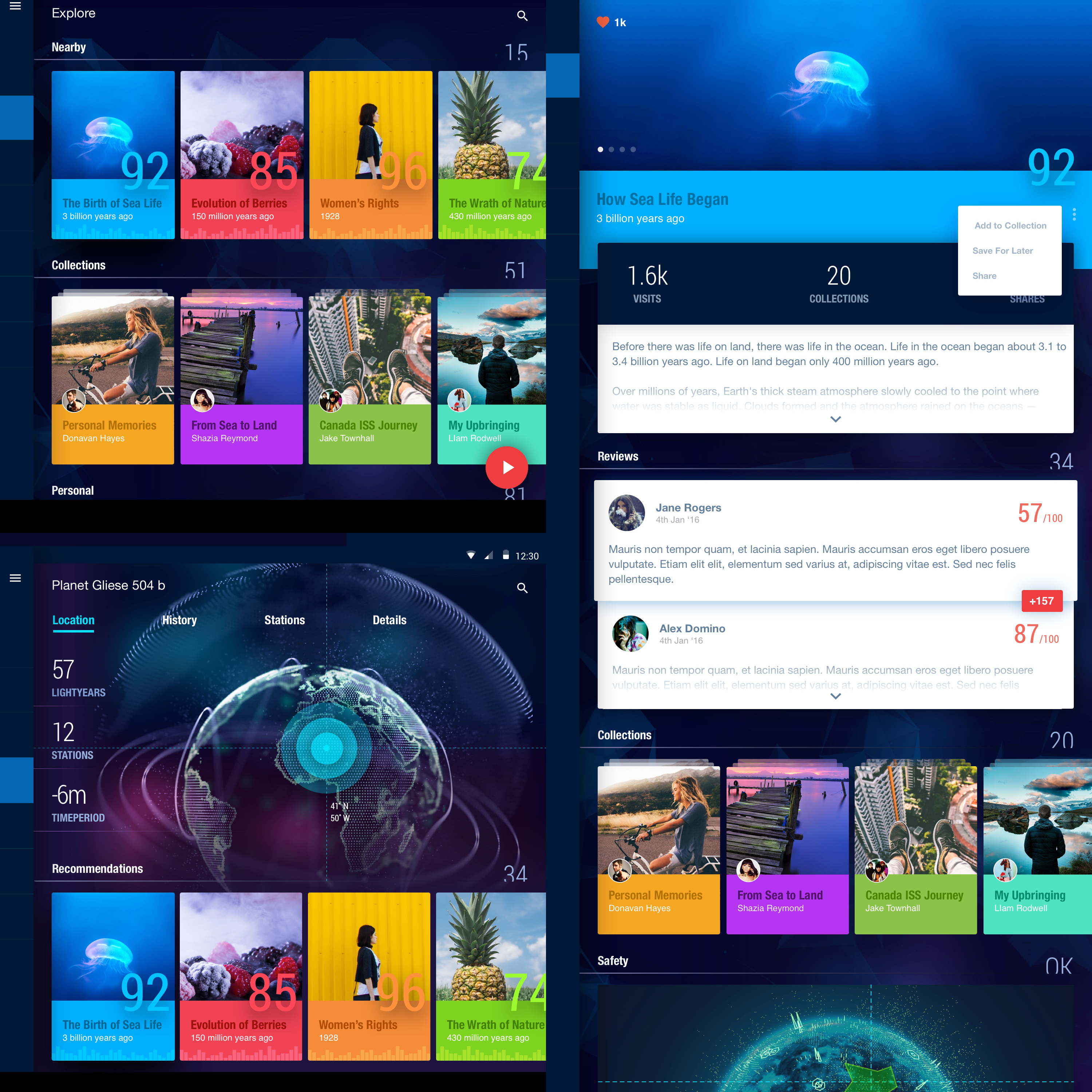
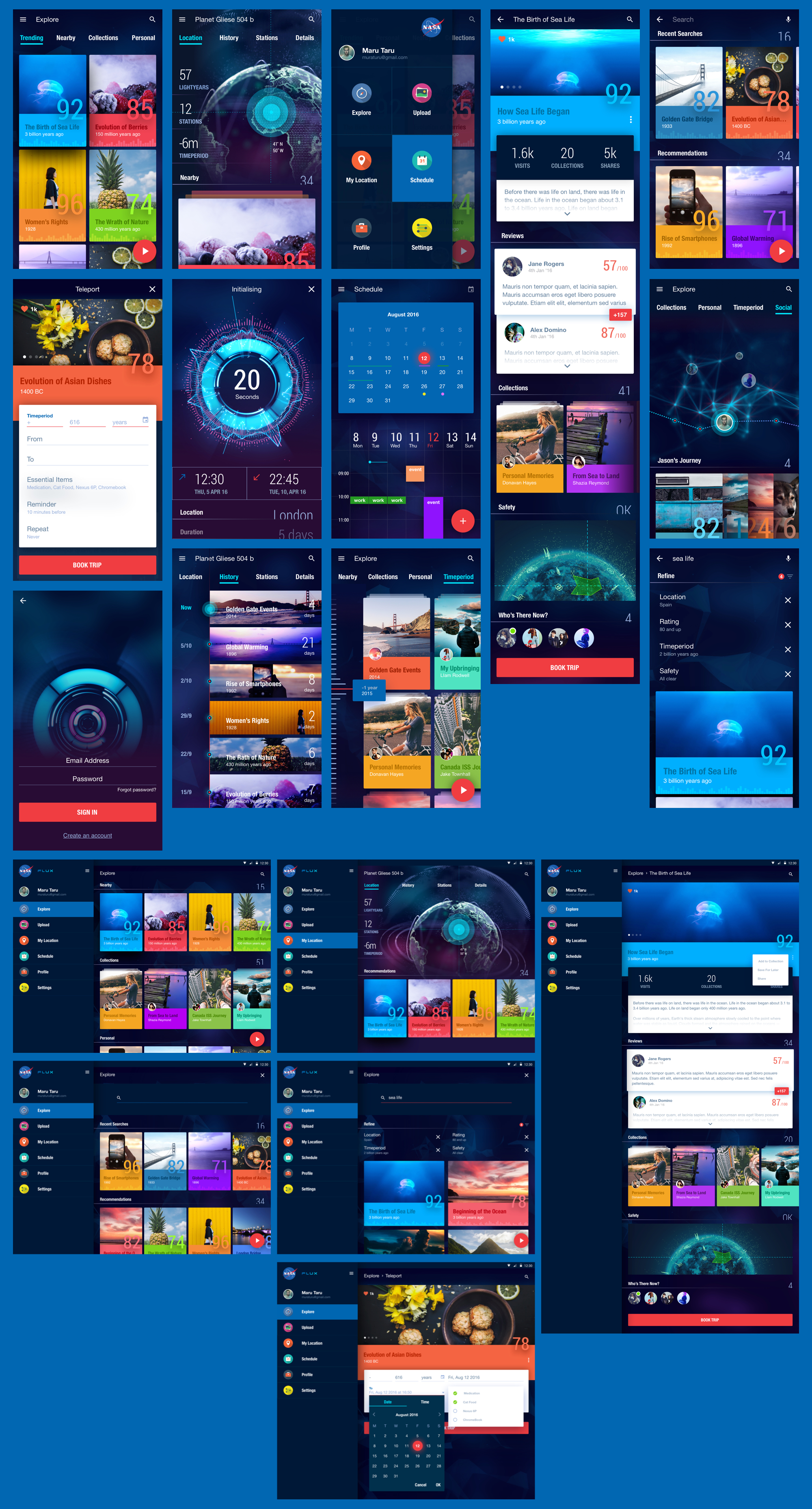
Inspired by the Material Design framework, I debated on the best approach to seamlessly incorporate NASA’s brand guidelines. As the design of the app had to be on-brand, I used Helvetica as the main body font and Roboto for the condensed numbers. The colours used including various shades of blue, red and black were also on-brand.
The background was designed to be used alongside a parallax effect where low-poly elements would move subtly as the user scrolls up, down, left and right. The dark tone makes the content more prominent and compliments the bright colours and imagery.
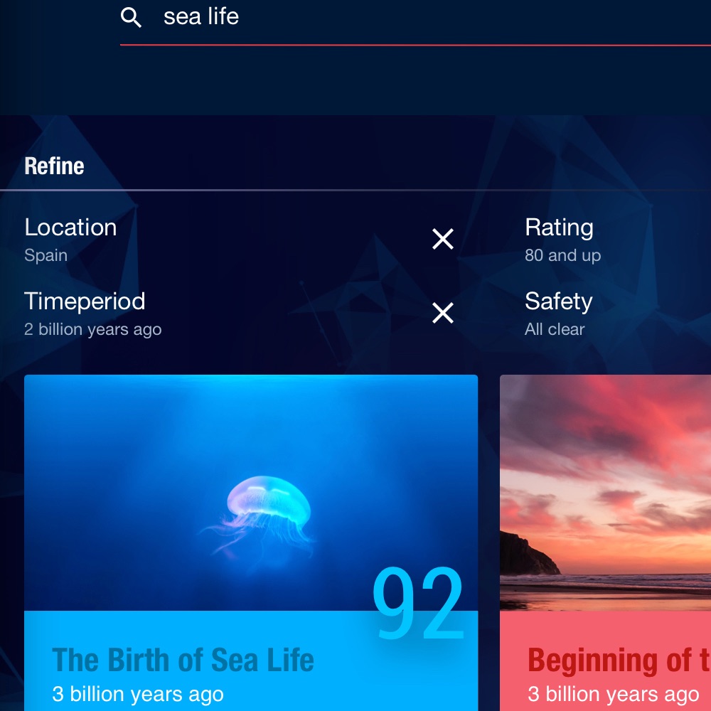
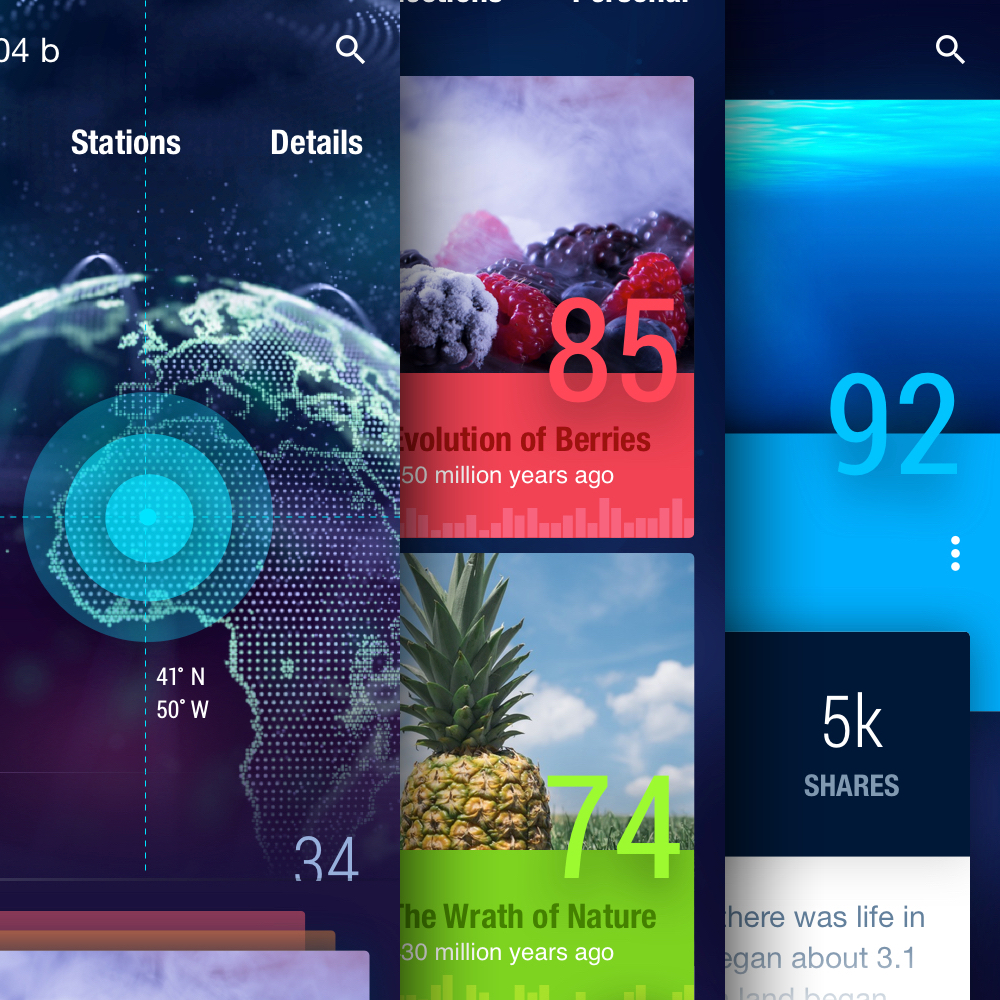
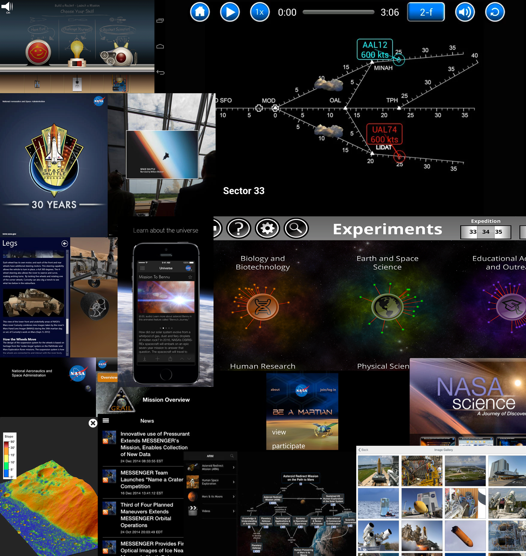
The overall tone of the app is dark and futuristic. I wanted to explore what my version of the future will be when time travel is the norm. I believe that the theme is consistent with current NASA apps available in the market today.
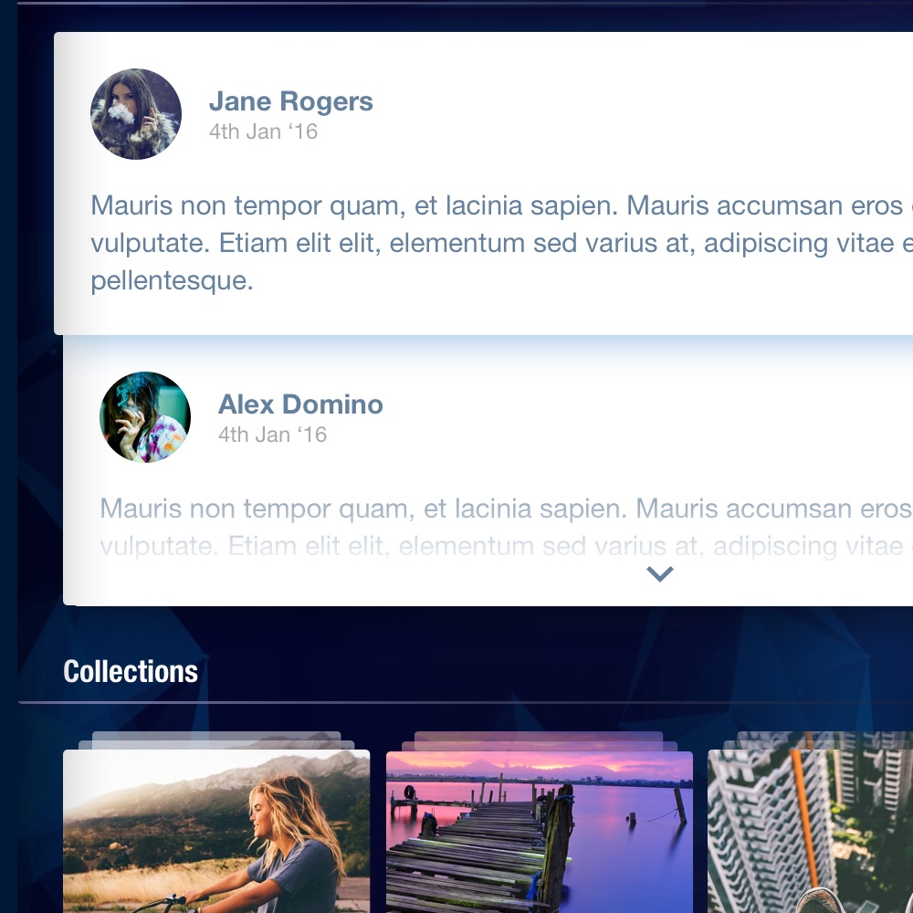
Content including forms, popovers and full text areas are the only elements with a white background. This is to ensure that content is easy to read and accessible.
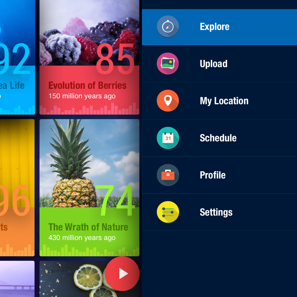
The red accent colour is used for primary active states such as the FAB, submit buttons, input fields and toggle buttons (favourite, +1, calendar select). I decided to use the red over the blue for the primary action as it’s more prominent.
The blue blends too well into the theme so it’s used as a secondary colour for less used elements such as active drawer icons and the calendar background.
The colours for the form elements uses a soft shade of blue for the default state. Some elements such as the search, filter, calendar icons have an active state where the opacity is reduced. This is to prevent conflict between the primary actions on a screen.
The cards were designed to include compact information about an event. Each card has a fixed size for responsiveness and contains an enticing hero image, title, time period, rating and monthly trend. The colours used are vibrant and based on the most prominent colour within the hero image.
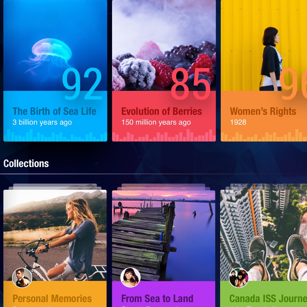
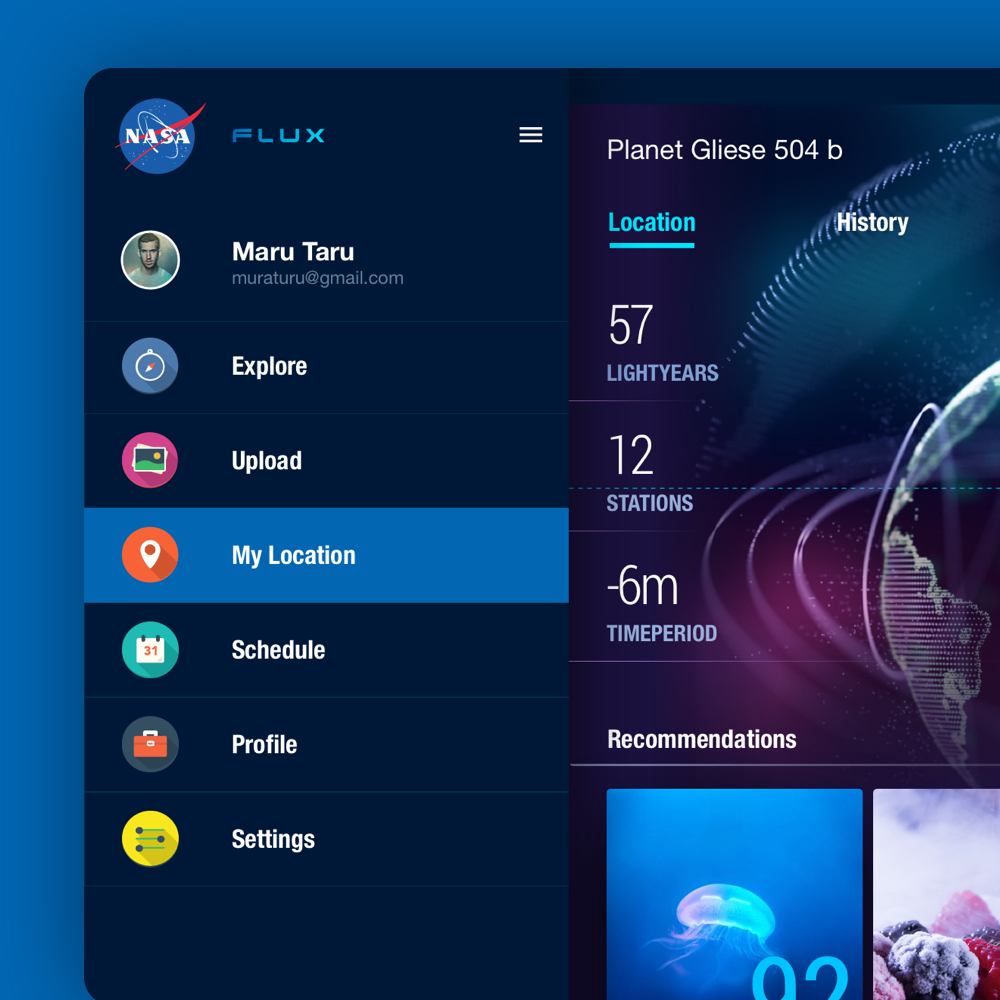
Transforming the mobile mockups to a tablet was fairly simple thanks to the Material Design guidelines. Using cards made adjusting the content seamless as the size remained consistent. The drawer was collapsable and could also remain fixed for faster access to different sections.
As I was having a lot of fun working on this design exercise, I included additional features that I believe would be useful if time travel were possible.
The user can scroll through the most defining events of the year using the infinite timeline scroller. Pressing harder at the top or bottom will make the collection of cards scroll faster. Selecting a collection will display a horizontal timeline where the user can scroll left or right to display the most defining events of each month.
The user can search through their friends travel timeline and discover new events. The timelines can be scrolled left or right to view the start and current/end points. Pinching in and out will display the timelines of the friends who have previously travelled and are travelling now respectively.
A lot of our lives are spent waiting in queues. Taking advantage of the daily commute will allow us to get to work in an instant. The user can schedule frequent trips to avoid the grind.
I included a feature named Upload that can be found in the drawer. This feature would allow the user to take a photo of an object or a moment, and then review the past and future versions through a timeline interface.
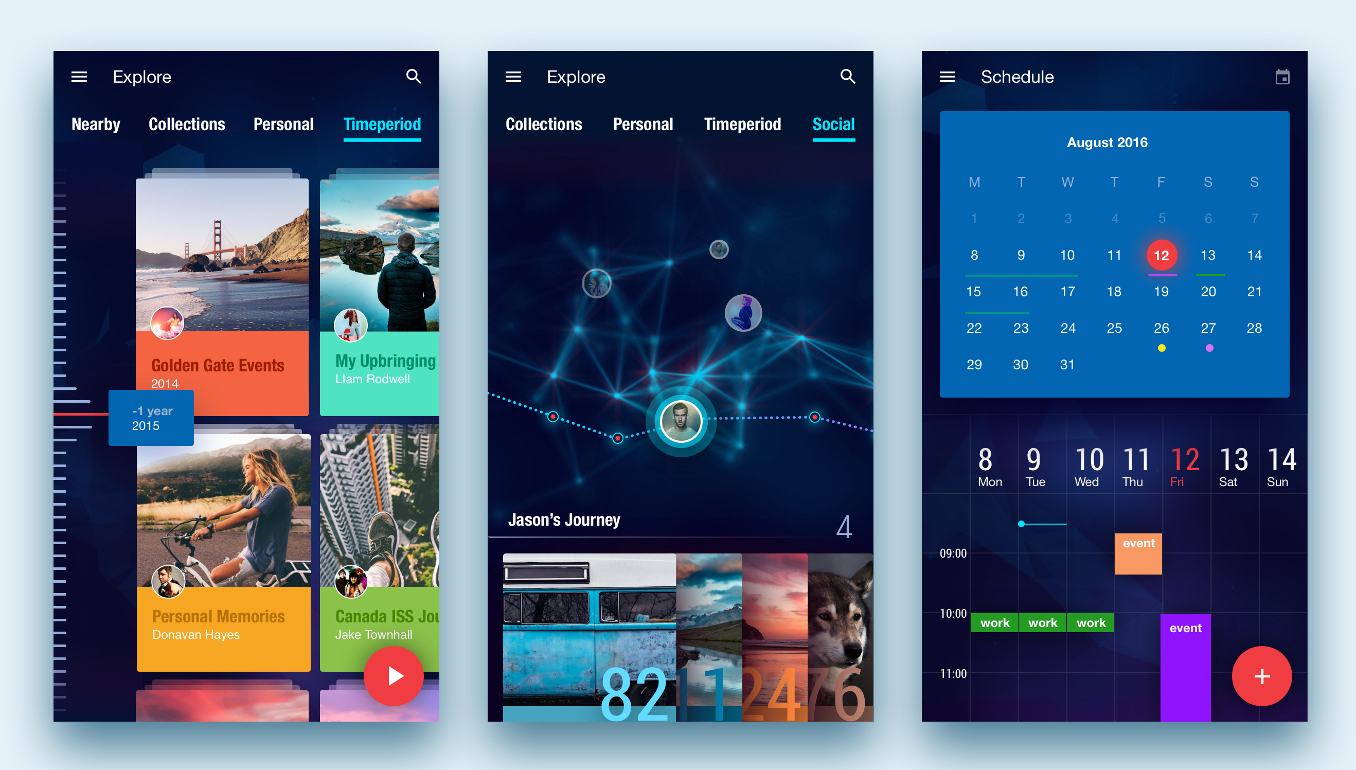
If I could travel back in time, I would like to have focused more on determining what each screen would look like with different states such as preloading, empty, filled, overflowing and inactive. It would have also been great to spend more time refining the visual elements as exploring futuristic concepts was rather fun!
Find This Garment –
Imagine a mobile app that enables you to impulsively identify and purchase a garment or accessory that you see in real life. Design an end-to-end flow covering the experience from the moment of awareness to purchase completion.
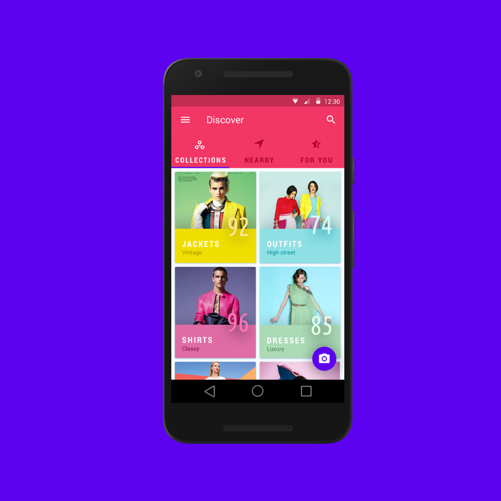
I have been tasked by the design team at Google to envision an app enabling the user to capture and purchase items of interest using image recognition.
I will assume that natural language descriptions of images have matured and the device used consists of a relatively high quality camera. Images are also assumed to be taken in good lighting conditions.
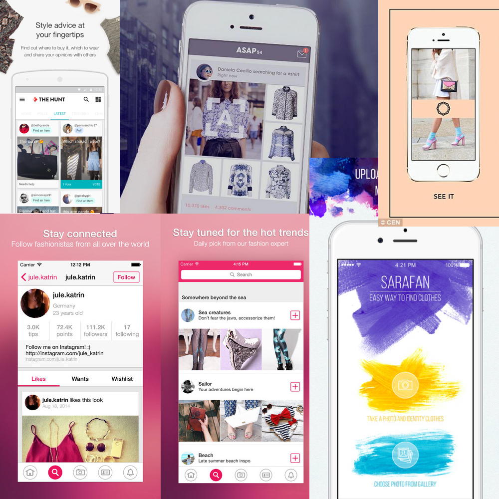
I began by researching competitors that currently exist in the market. Based on what I gathered, there was a popular vote for point and shoot features. The majority of the apps required minimal steps from snapping a photo and returning the results. After reading the reviews, it turned out that the app relied heavily on the image processing algorithm which unfortunately was not as accurate as predicted. Nonetheless, the UI of the apps researched appeared intuitive and similar to each other.
In terms of the branding, I noticed that the apps employed rich and vibrant colours. I assumed that the target audience were the younger generation such as users who would be familiar with using Instagram and SnapChat. The apps were image heavy with limited text. Nearly all of them consisted of a light interface and a grid layout.
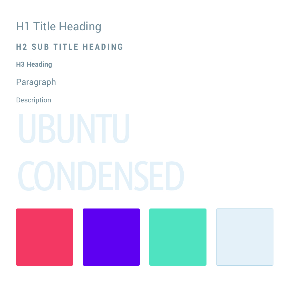
The brief stated that the app was for Google. As an avid fan of Material Design, I decided to incorporate the visual language into the app. The fonts used for the headings and paragraphs are both Roboto Regular and Condensed. The Ubuntu font was used for text containing numbers as I found it to be complimentary to Roboto whist taking up limited real estate within compact areas.
The colours chosen were inspired by the vibrancy of the fashion industry. Bold, vivid, electric and iconic are some of the words used to decide on the palette. As the app was aimed at the younger generation, I wanted to ensure that it will stand out from the masses.
I started to explore the idea of envisioning my own version of the apps that I previously researched. I believed that undertaking an action such as retrieving items from an image would be slightly different compared to the traditional search engines that only requires keywords or voice commands. Google Goggles painted a fairly accurate picture of what can be achieved through this but it seems to be a very challenging area to tackle due to a lack of high-end devices, image quality, analysis and speed or retrieval.
I began by attempting describe the characteristics of the user and the keywords associated with them. The brainstorming process helped me to unearth the relationship between the user and the goals. Finding connections can help foster new ideas. Finally I moved onto designing the rough sketches.
The rough sketches provided me with a foundation to begin tacking the problem. The main feature of the app was to allow a user to take a photo and then purchase the items derived from the photo. In between those two actions could consist of many micro interactions and processes.
The UX will be dependant on the algorithm used for identifying the object within the image. For example, the user may be instructed to highlight an area or if the technology is more advanced, then no interaction may be required. If the algorithm couldn’t detect any objects within the image, then will the entire process have to start again? What happens if the opportunity has already been missed? e.g. the person wearing the item of interest has left the building?
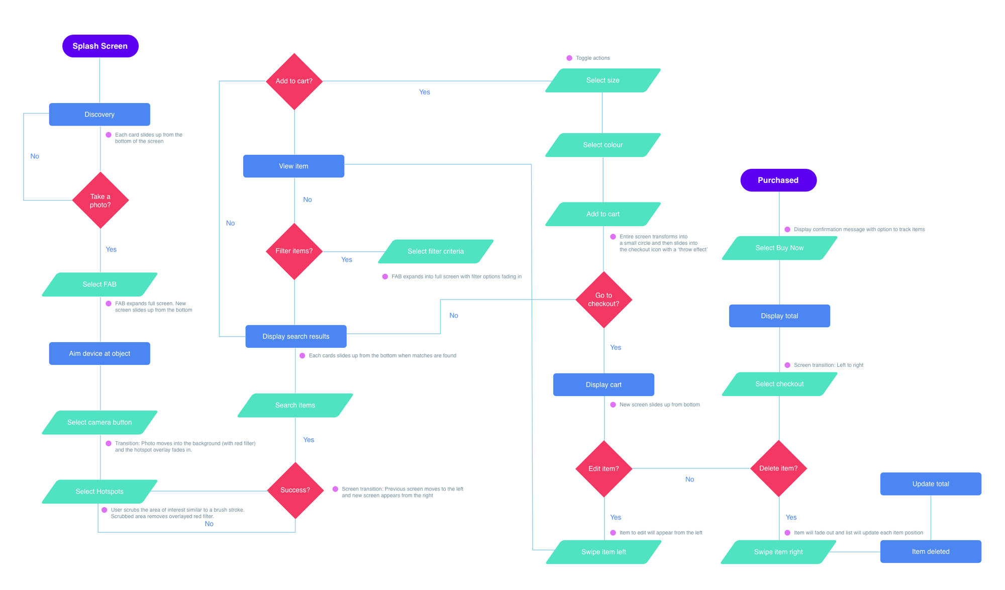
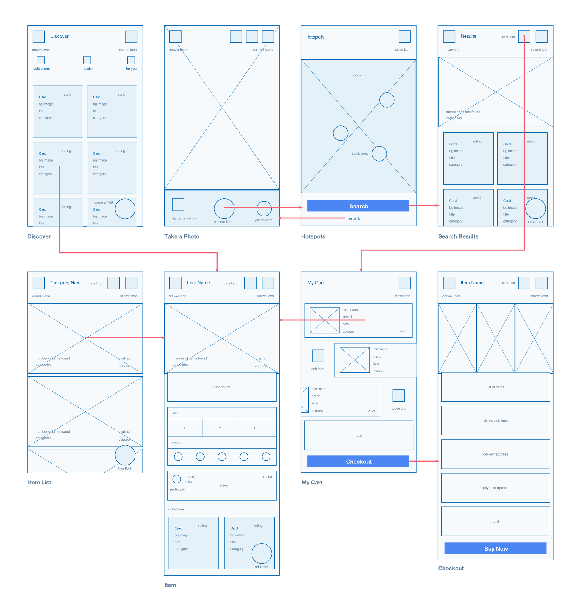
I began by putting myself into the user’s shoes and envisioning the steps required to undertake the task. Certain decision will have to be made along the way and one of the best ways of clarifying them is through an interaction flow.
Designing an interactive flow helped me to determine how the user thinks. As design is a set of decisions, mapping out the journey from inception to completion can validate whether my assumptions are in line with the user’s goals.
Edge cases can be tricky to detect and figuring out whether the flow is heading in the right direction can be a catch-22. Determining what to do when things go wrong will aid in making the user feel at ease as there will always be an option to opt-out if necessary.
I’ve also described the animation states to occur when a specific action is competed or in progress. Certain transitions such as making a screen slide in/out can also ensure that the user understand that they are progressing throughout the app.
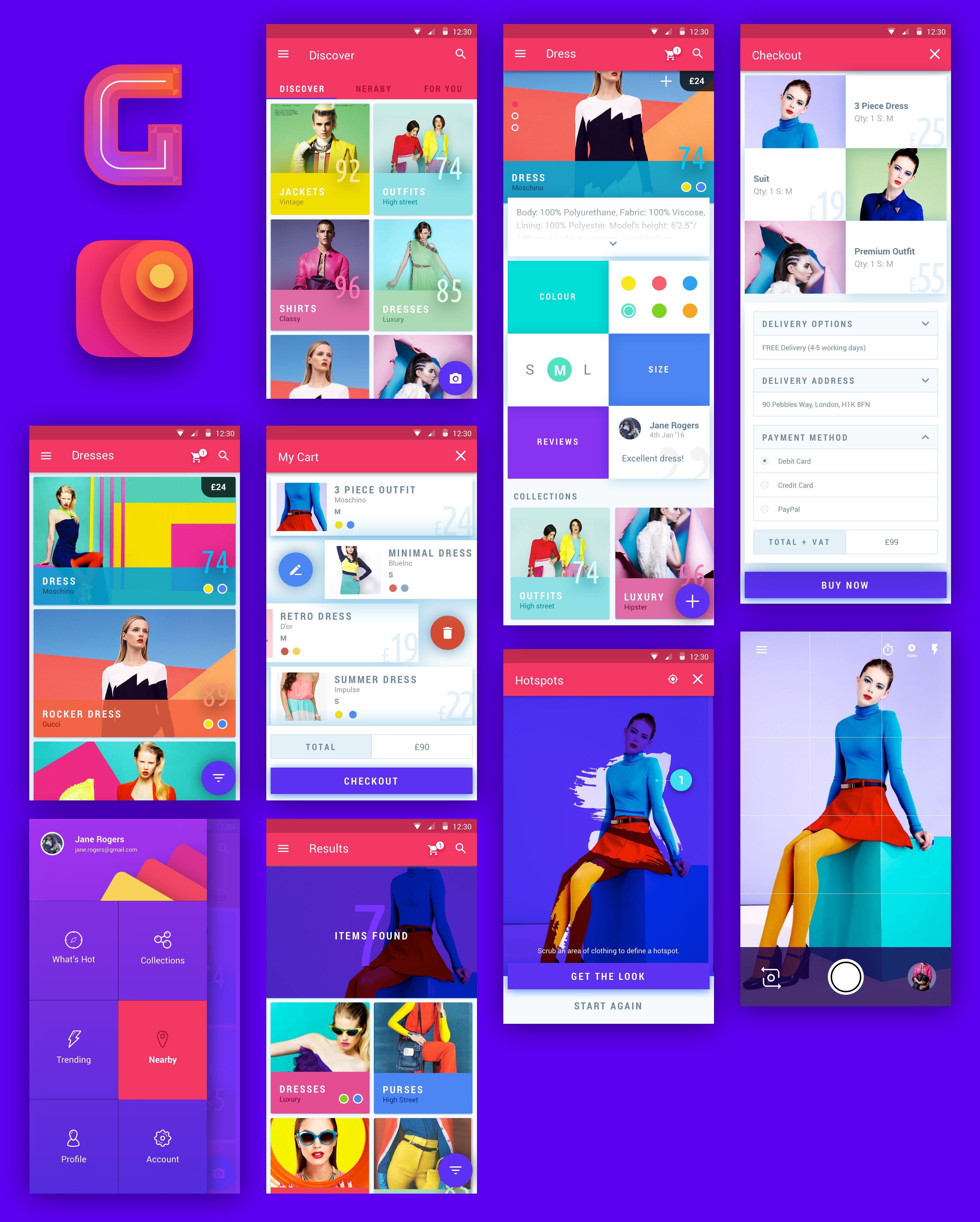
As with most rough sketches, refinements will be required as you gain more insight about the goals of the app. I discovered that the navigation could be improved to enable a more seamless experience when going from screen to screen. I also illustrated how elements are connected to a screen in order to determine the target destination.
During this stage, I had to think more critically about how the user will be flowing around the content and interacting with certain elements. For example, the ‘taking a photo’ screen includes a camera button which when pressed, initiates a new screen. I had to determine whether the user will taken back the previous environment or whether a new screen will be initiated in order to move on to the next stage. I determined that moving forward should simulate a real life experience in terms of some level of uncertainty, but with consistent feedback.
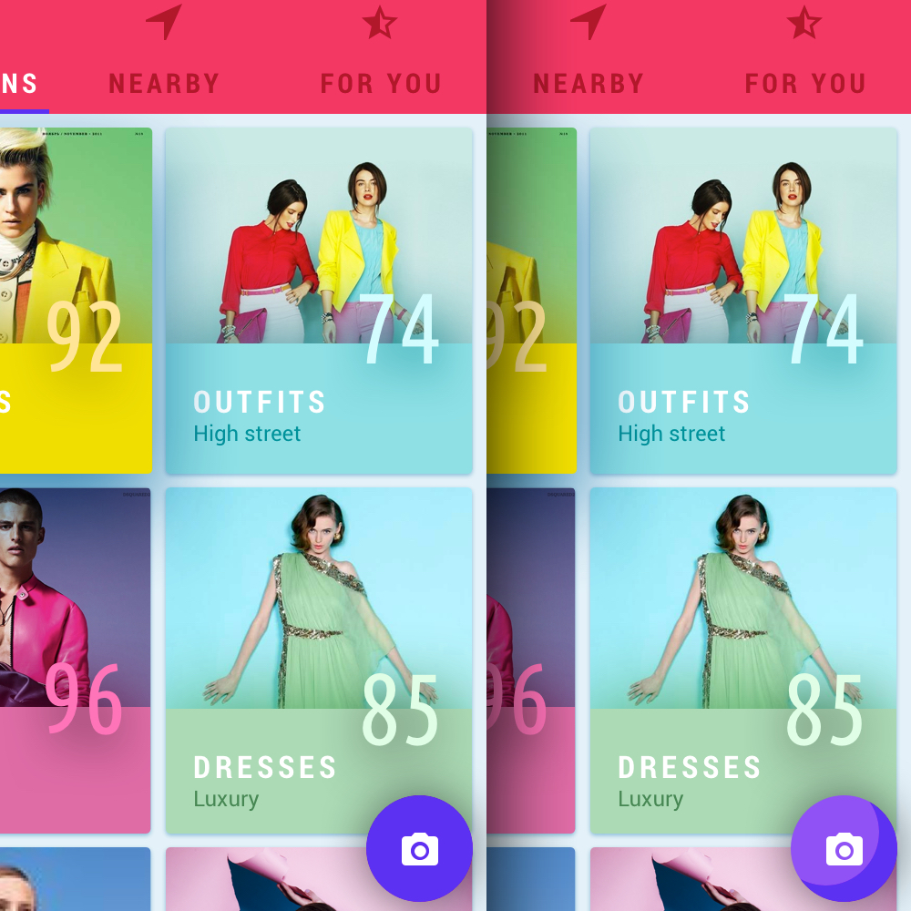
As this design exercise leaned heavily towards interaction, I took into account how, when, why and where the user will interact with the UI elements. Determining the state of the UI whether it’s through colour, shape, form or motion can make or break the experience. I wanted to ensure that the user would be comfortable through consistent feedback throughout the journey.
The floating action button is a primary action sitting at the top of the screen element hierarchy. As the element sits behind the most dominant feature, I wanted the experience to be delightful. The FAB creates a wave effect as soon as the user presses up. Once selected, the short journey to discovering the mysterious garments and accessories behind the photo begins.
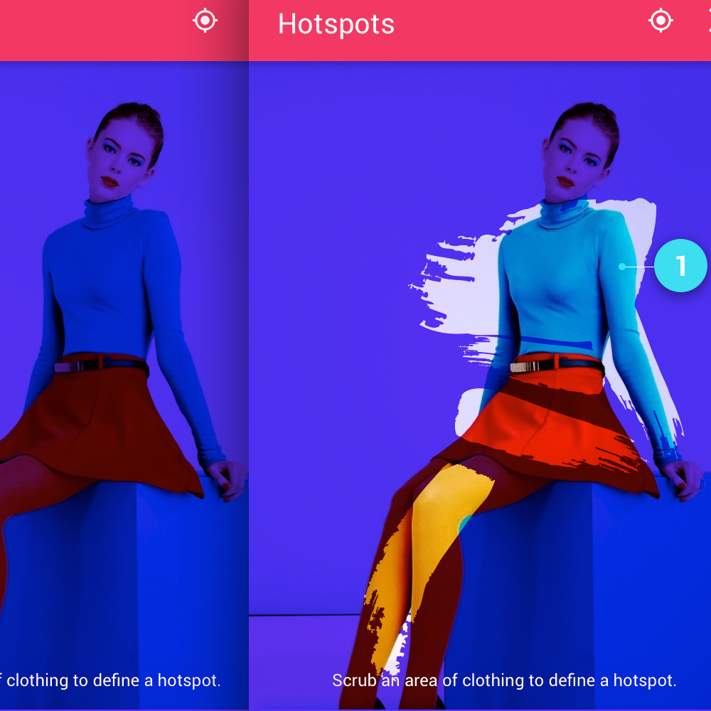
This interaction requires the user to scrub or smudge an area on the screen which contains the object of interest. This technique is fairly experimental as I believed it was the best way of getting from A to B in the fastest time possible, whilst also making the experience enjoyable.
I was inspired by colouring books as they’re known for being delightful to use. The paint brush effect inspires the user to paint objects on a canvas. An alternative would be to circle an area but as there could be many objects in the frame (some of them quite small e.g. earrings), it didn’t really seem practical. Plus it did not seem multi-touch friendly. As the user scrubs through the image, the overlay is removed revealing the object to search. Upon finger release, a circle dot is created to highlight the area affected.
A toggle button eliminates the need for an additional button when attempting to complete more than one action. In a screen with limited real estate, the user can toggle each option to either display (active) or hide (inactive/default) information. This feature is widely used in popovers and navigation menus.
The user will be able to understand which state they are in through alternating styles and animation/motion. A default state will look similar to other relative elements as long as there is no interaction. An active state will see the item elevate through an animated drop shadow and the chevron icon rotated upwards.
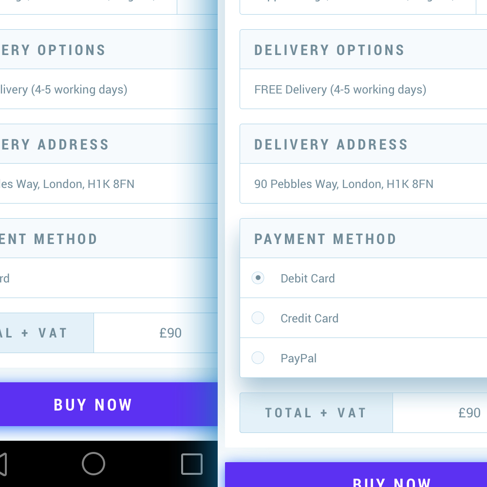
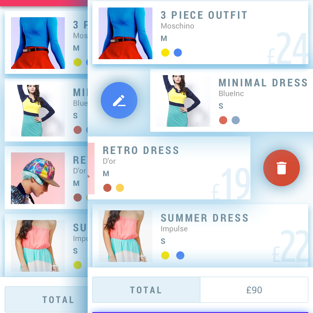
As the UI relied heavily on cards (both vertical and horizontal), an added benefit is having the ability to interact directly through certain gestures. As cards are fairly compact and limited in their functions, users could discover new ways of completing actions through swiping left and right.
Here a card can be edited by swiping to the left and deleted from the right. These gestures are fairly universal so the leaning curve is small. This feature eliminates the need to include repeated icons or popovers.
Overall I enjoyed tackling the problem and exploring more of Material Design. Due to the restricted time limitations, I would have enjoyed developing an interactive prototype to demonstrate the context, interaction flow, motion, transition and states of the UI. I also believe the app would benefit from additional visual refinements. Finally, the hotspots relied heavily on the algorithm so unearthing edge cases through experimentation could have improved upon the experience.
My client, a former designer at Google approached me whilst I was wrapping up my latest design project. After graduating from TechStars and securing £1M+ funding for his startup Kalo, he needed help with creating a more visually appealing and robust platform. I was tasked with creating a new, intuitive UI for the Kalo desktop platform as well as redesigning the UX from scratch, prototyping, interaction and animation.
The idea was to create a supplier management SaaS platform where clients can easily manage their vendors. My client explained that based on personal experience, it’s very difficult to manage external agencies and freelancers within a large organisation.
Keeping track of who is doing what, where and when could be managed much more efficiently in the cloud. The application was aimed at 2 target audiences, clients and suppliers.
After having an initial conversation with my client, piloting the MVP and submitting the client survey to uncover the needs of the user, it was clear that this would be a challenge that I’d enjoy. He stated that he wanted to create the best possible experience through visuals, interaction and motion.
As design founders are quite rare to come across, I knew it would be a match made in heaven! After I gathered the necessary resources, I went straight to the drawing board and began researching competitors and sketching out ideas.
Initially I was tasked with undertaking a small design exercise to understand the workflow and design a base UI that could be iterated upon at a later stage. Designing a visual language that was going to be used consistently throughout the app provided me with an opportunity to explore new typography, layouts, accent colours and patterns.
When I inquired about providing inspiration to help with direction, it turned out that my client was just as much of a fan of Material Design as I was! The spec provided a great foundation for structure and common design patterns.
My goal was to create a visual language that was intuitive, easy to understand and delightful to use by guiding the user with feedback using motion. The UI is built with reactivity in mind, meaning that I could ensure the user never gets lost by guiding them with instant feedback during the start, middle and end of each action.
Inspired by material design, the structure is very modular as my aim was to minimise cognitive load by masking non primary actions inside of compact modules formed as independent buttons. I applied modularity as a design principle to help the user focus on the task at hand. By incorporating z-depth to display dimensionality, the modules appeared independent of each other even though their positioning was relative.
This reactive system also provides flexibility when using the app on a smaller device. An example of dimensionality is when a client attempts to add a supplier to a category, they can decide to add a new category if none are found. Selecting this option will trigger an inner module that is independent of the outer module. There’s no need to click back and forth and the task is not interrupted with alerts. Once a new category is added, feedback will be displayed instantaneously.
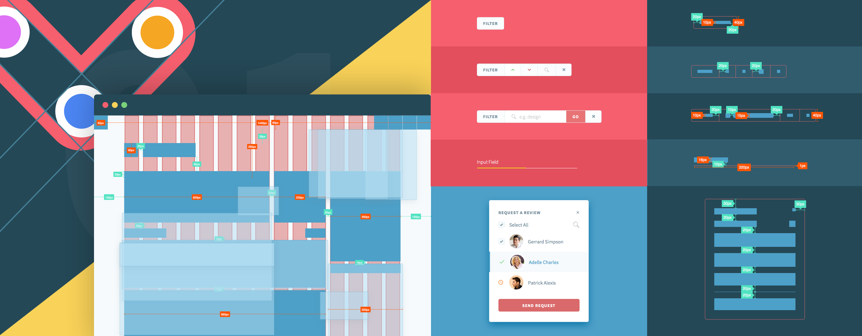
The methodology employed was agile so each user story was formed into epics that are just a series of small user stories. Working directly with my client, I broke down each epic into user flows by identifying inputs, outputs, processes and other interactions to determine how best to achieve the goal in the shortest amount of time and with the least amount of effort.
The process is fairly iterative in order to prevent wasting time and resources. Each user flow, wireframe and mockup required frequent communication between my client, the engineers and myself. After the user flow was approved by the team, I then went on to creating the wireframes followed by the high fidelity mockups.
I had regular meetings with Peter (online and onsite) to discuss the design feedback and apply any amendments if necessary. I also collaborated with engineers to discuss the spec sheet and recommend improvements to the visuals that may have been missed, left untreated, or not aligned with the visuals in the mockups. Going agile can sometimes make the small details easy to miss!
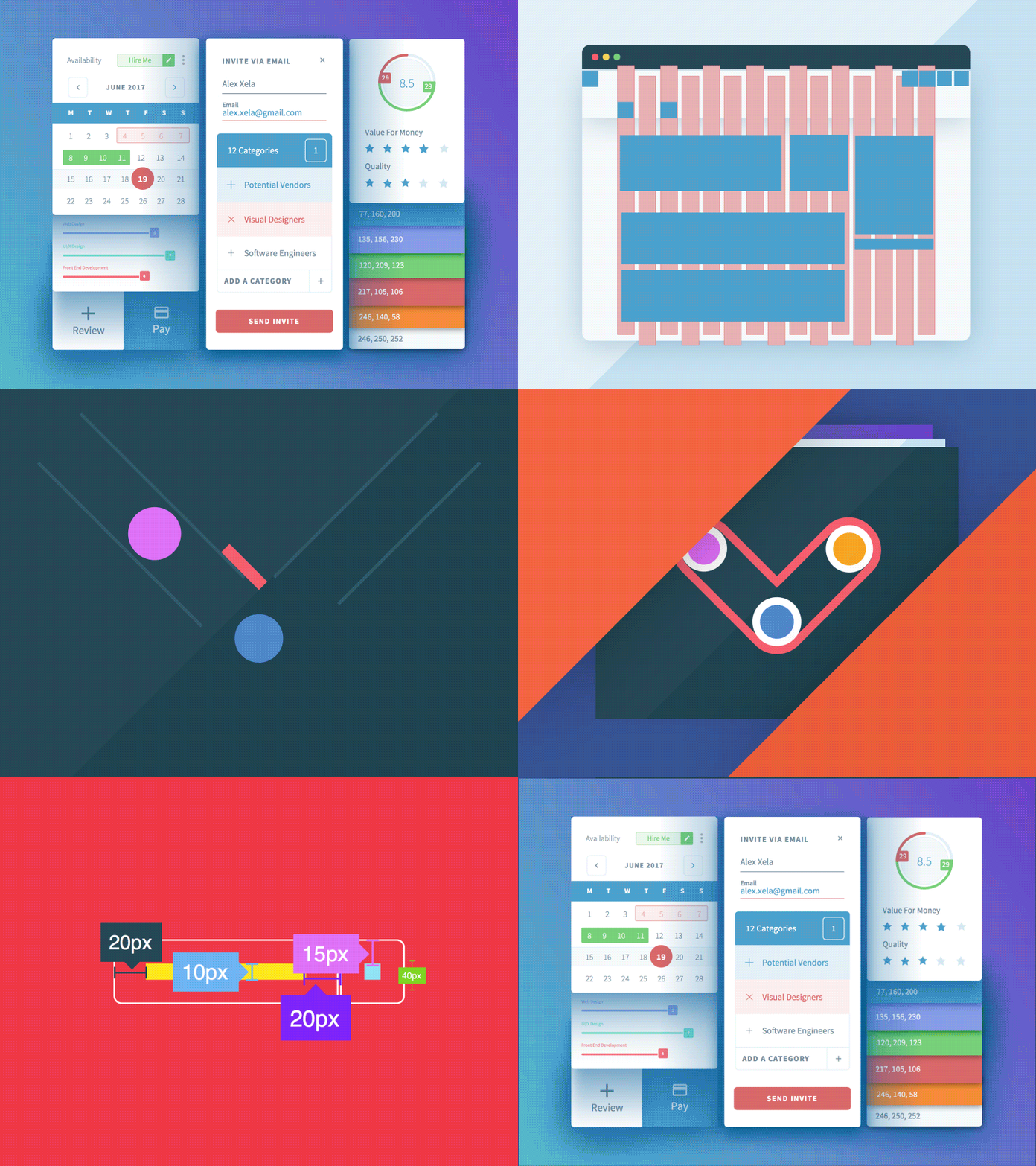
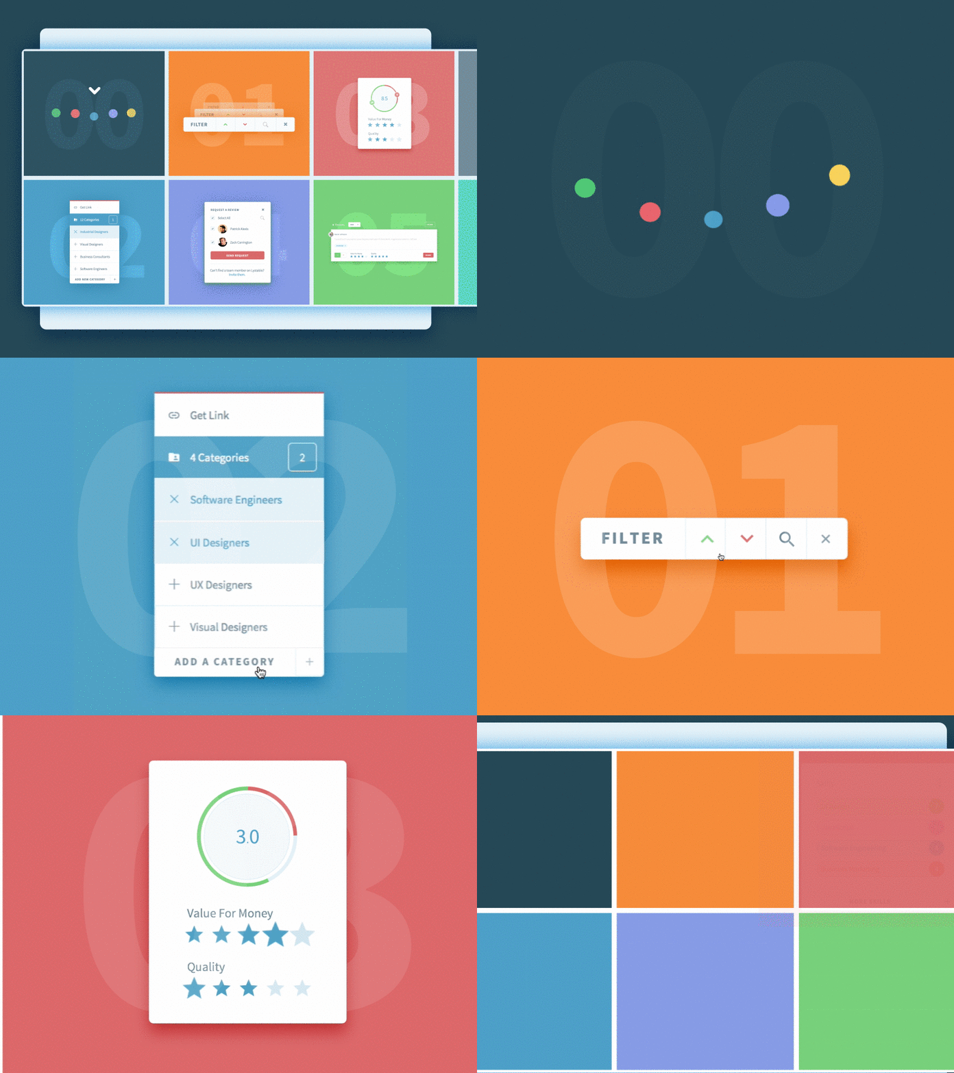

Since April 2015, I have designed and iterated on over 200+ high-fidelity mockups for both desktop and Chrome, created countless user flows and wireframes, designed a full page marketing site, hand-coded interactive prototypes, animated logos, generated an intricate style guide and spec sheet.
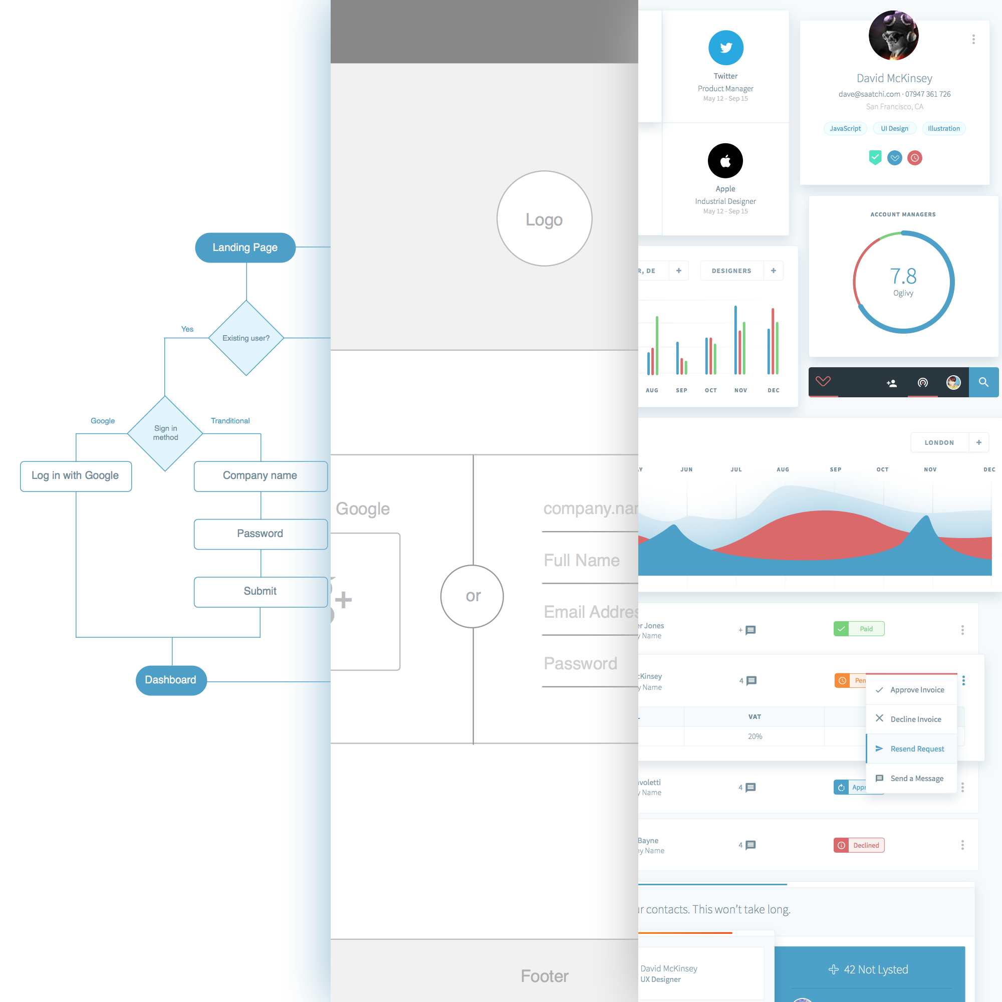
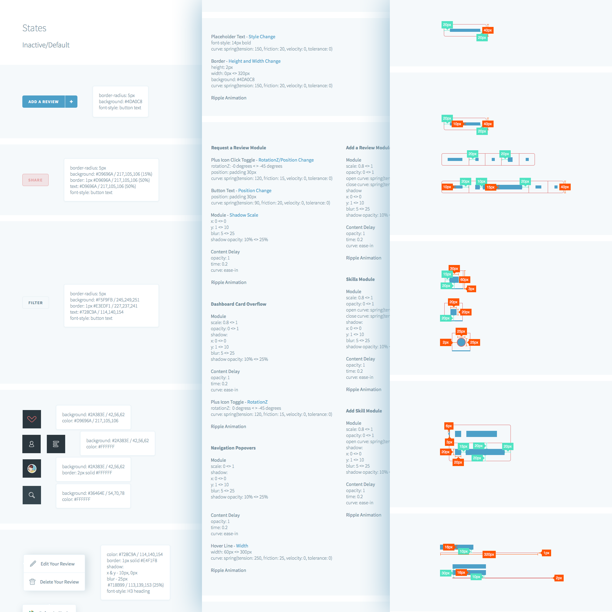
Even though the app is still in beta, I consider it a success based on what I’ve heard from real users so far. The feedback has been very positive! Kalo has already lined up some big name companies to pilot the app and they’ve received quite a bit of praise for the intuitiveness of the UI and UX.
To be part of building a product from the ground up and seeing it grow into a platform where real people use it has been surreal. It’s been a team effort that has required constant communication between myself, the founder and engineers. To make peoples lives better through design, even if it’s just a little bit, is why I do what I do.
I was approached by a small recruitment firm based in Central London inquiring about a complete overhaul of their brand. My client required a full range of services including web, print and logo design. He wanted to move away from the generic recruitment agency style and introduce something fresh and modern. I thought it would be a great opportunity to try something new and see if I could challenge the status quo.
I was tasked with creating a new and modern brand, designing and coding a marketing site, designing print material including business cards and brochures, and designing and developing a sales dashboard.
The old Satigo brand was generic and predictable. The colours didn’t really represent the vibrancy of the agency and the style felt slightly outdated.
The website didn’t stand out amongst the saturated sea of agency sites across the web. Satigo had two target audiences – companies looking to hire, and candidates for hire. The static site didn’t really communicate Satigo’s mission clearly and there wasn’t any information about current opportunities available by the agency.
The company was having a hard time tracking their sales as they had to rely on tedious spreadsheets to see how the whole sales team was performing. The spreadsheets contained raw data that required lots of scrolling and wasted paper.
I crafted a survey for my client to try a gauge his intentions, company information and target audience. A few phone calls later it was clear that the open-ended project would be quite a challenge that I would enjoy tackling. I then proceeded to devise a clear scope that outlined expectations, goals, milestones and deliverables.
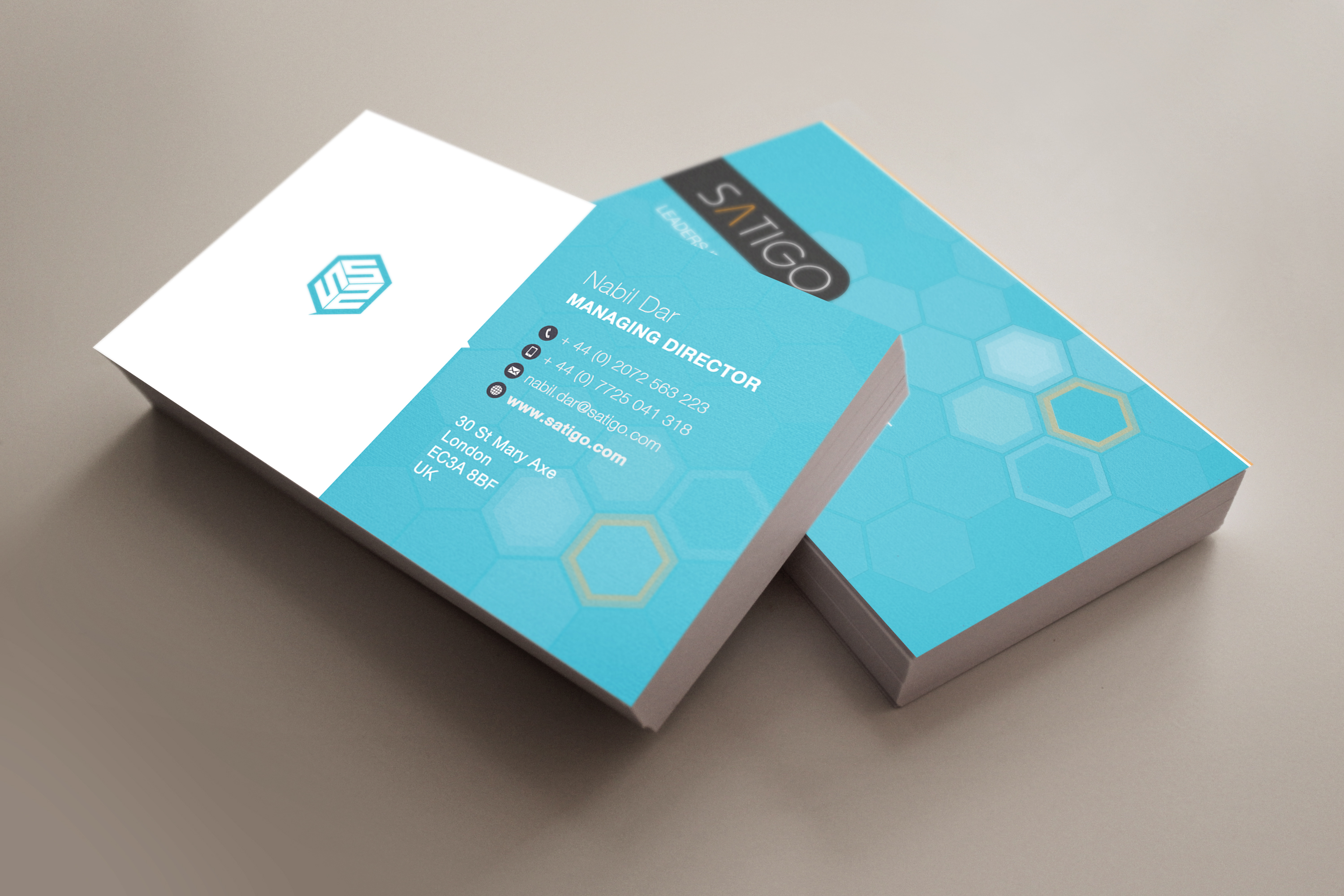
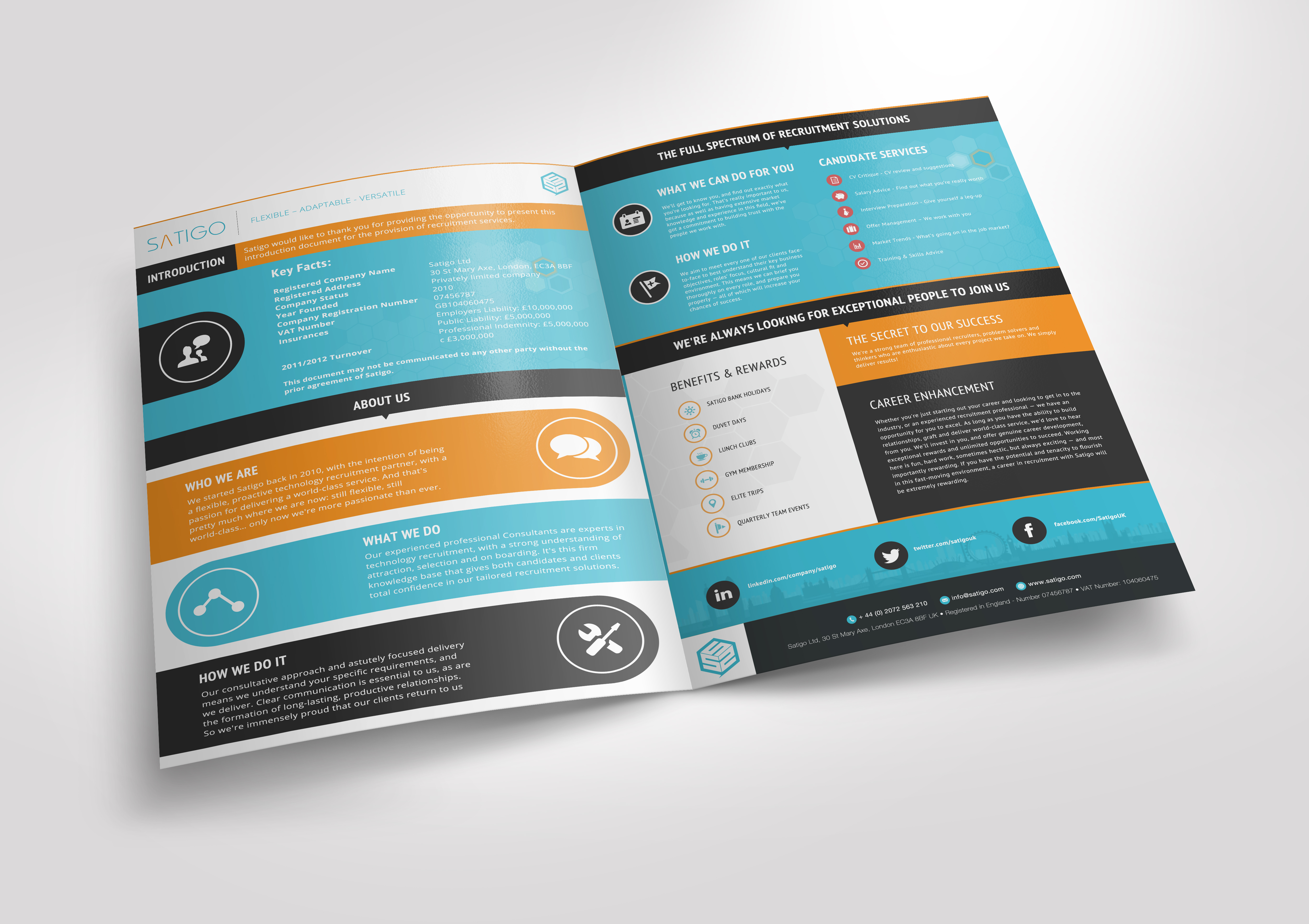
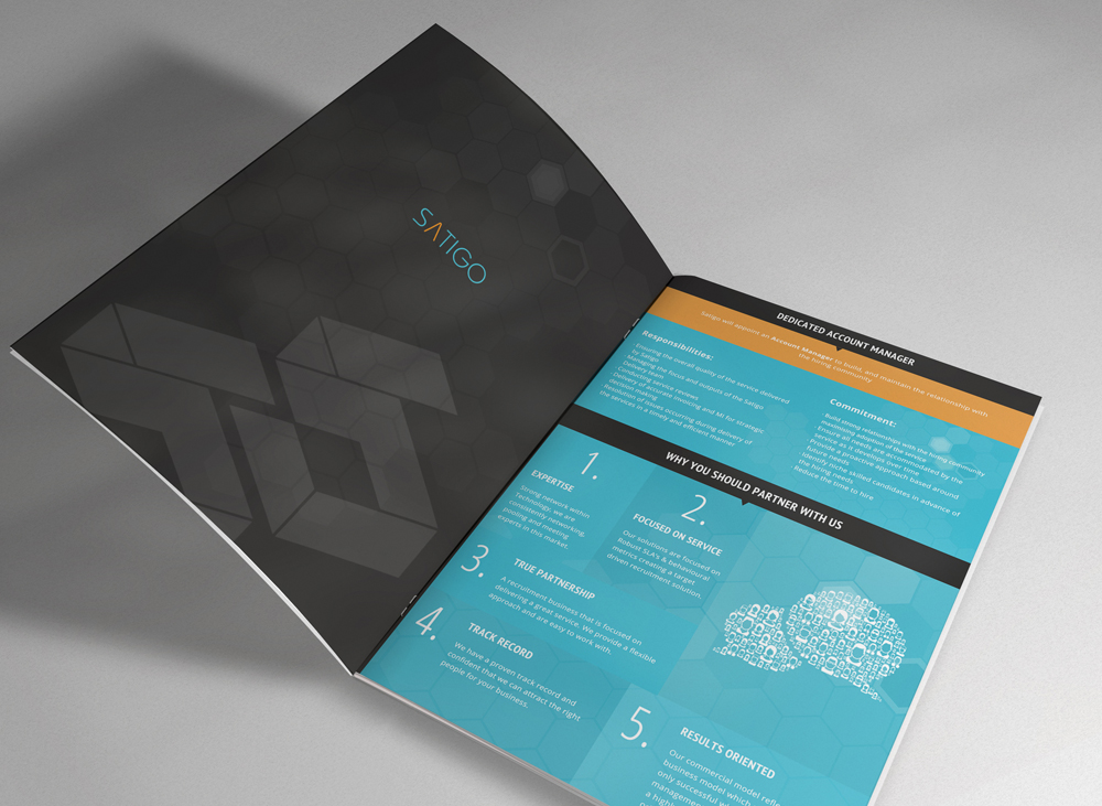
Reinvigorating an entire brand seemed daunting at first as there is no right or wrong solution. The output is very subjective and there can be countless revisions due to a lack of direction. Thankfully the survey narrowed down the requirements and provided me with a somewhat clear path to investigate. The logo and mark had to be recognisable in black and white, small and large and on web and print.
I was provided with examples of what my client saw as inspiration for the website. I took into account the keywords that were being described during our meeting to help with the direction. Words included modern, fresh, different, loud, one-pager, visual and not too text heavy. Defining which target audience to design for turned out to be quite a challenge as there was a clash between modern (candidates) and traditional (companies) styles. I had to ensure that both were being catered for. The website had to be fully responsive and work on all modern browsers.
The requirements for the dashboard were fairly specific as the sole purpose was to make it easy for my client to glance at the real-time sales statistics on a TV monitor instead of staring at rows and columns in a spreadsheet. So that meant the style of the dashboard had to be obvious, easy to digest and predictable. The dashboard also had to be fully responsive and work across all modern browsers.

My client iterated that the brand should reflect Satigo’s mission of being a leader in recruitment. The logo and mark was to stand out and move away from the generic recruitment stereotype.
My process consisted of plenty of sketching, constant communication and many iterations. My intention was to get out as many ideas as possible, even if they did seem rough or wild! This left more room for experimentation. I used Illustrator and explored complimentary colour palettes. I mixed and matched colours that felt electric and finally settled on blue and orange. I would present my work for feedback, even if it was unfinished and then iterated as necessary. Rapid prototyping helped me get closer to the goal much faster.
Eventually we settled for an abstract mark that was bold, strong and dimensional. The simplicity of the design allows the mark to be easily positioned on the web regardless of whether it’s a social media icon, favicon, grayscale overlay or print such as signage, business cards, t-shirts and brochures. I finalised the assets in Illustrator and then the vector artwork was sent to the printers.
The marketing site had to communicate to both audiences – companies looking to hire and candidates available for hire. I had plenty of direction derived from the branding task so I knew roughly to approach the design.
I began sketching out wireframes that demonstrated the architecture and hierarchy of the information and overall layout of the one-pager. The brand colours were included along with the logotype. The copy was supplied by a copywriter so I had real data to play with.
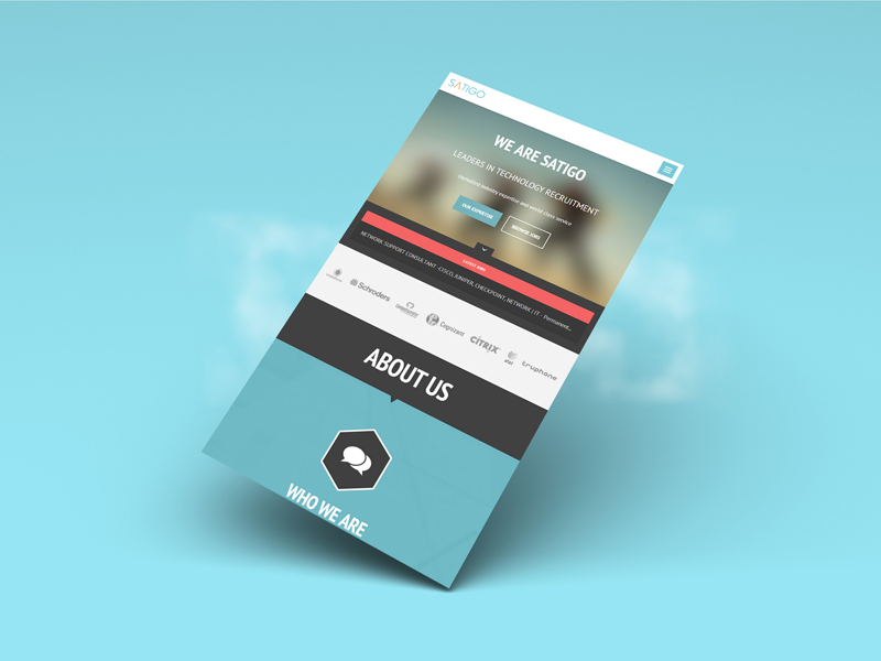
Once the wireframes were approved, I then moved on to the high fidelity mockup. I approached the design mobile first as I could focus on the essentials without bloating the site with unnecessary visuals. Part of my task was to design the site similar to an infographic as opposed to a generic about us site. The font used was clear, bold and craved attention.
After the mockup was approved, I then began developing the site based on a static template that was recommended by my client. I had to convert the site to WordPress as a real-time ticker was required to display the latest jobs from the MySQL database. I adapted the template using HTML, CSS, jQuery, PHP and MySQL to fit the new design and ensured that it was cross browser compatible and fully responsive through testing.
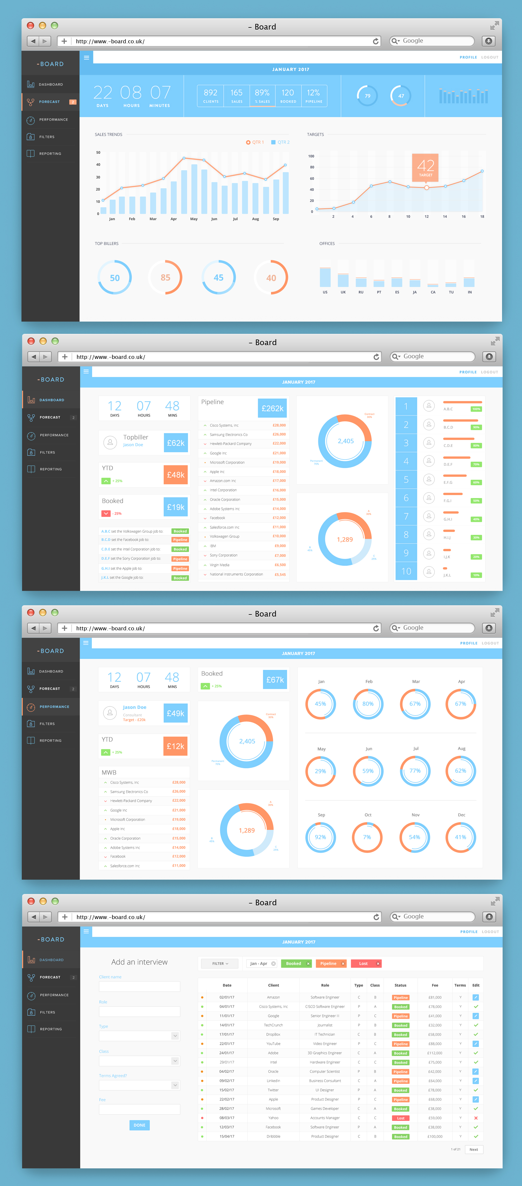
I was tasked with transforming a large Excel spreadsheet into a real-time, interactive dashboard for the web. I gathered the requirements from my client through online and onsite meetings. The meetings consisted of presenting wireframes and deciding on the most appropriate chart to display every piece of sales data.
Once the wireframes were approved after many iterations, the high-fidelity mockups were designed. This step went rather swiftly as the dashboard is much more content-focused. I used flat design to keep the style simple and on-brand.
The design of the dashboard consisted of a sidebar for easy navigation access and a main content area for displaying the sales data represented by charts. Visuals are much more easier to digest than raw tabular data so a lot of pie charts, line and bar graphs can be seen across the app. The design of the sales form was important as that is what drives the dashboard. The limited amount of fields were carefully chosen in order to reduce cognitive load.

The project was challenging, yet rewarding. I managed to develop some new skills and I also had the opportunity to push myself personally as well as professionally. My client (as well as his team) was very satisfied with the results and based on what I’ve been told, the project has helped them reach their goals of attracting new leads.
I’ve been thinking about different ways that could make my life easier as a designer. There are many tools out there that helps my design process but sometimes I have to scratch my own itch! I’m working on a side project to help designers like myself be more productive by building a new community where resources are easier to find, manage and share.
There are a few issues that I frequently encounter when I’m working on design projects:
Designing an open-ended product where you are the client can be just as challenging as working with strict guidelines. I set constraints for myself to prevent feature creep, minimise perfectionism, and progress at a faster pace. Typically I would give myself 2 week sprints where I would exclusively focus on different parts of the project such as branding, UI design, UX design, icon design and marketing.
During the course of a few weeks, I let the idea manifest itself so that I could determine whether the solution was actually worth pursuing. Before I reached for my moleskin, I sent a few emails to a couple of fellow designers to see if there was any demand or whether they could resonate with the issues that I faced. It turned out that my assumptions were true!
I went ahead and followed up with a few more questions to try and refine the idea and gauge more interest. I used the lean methodology to ensure that I wasn’t wasting my time and building something that nobody wants by talking with potential users. Eventually I began seeing a pattern and deconstructed the feedback to mould into features shown below:
I then proceeded to draw a couple of rough sketches for the MVP. My intention was to validate the idea quickly and show something, even if it’s rough, to designers who I assumed would find it useful.
Over the course of a couple of weeks, I validated the idea and had a clear path to begin designing the high fidelity mockups based on the iterated wireframes. This meant quickly creating a brand and style guide.
I wanted the design to be simple, flat, modern yet flexible. Something that would work well with either a light or dark interface or a combination of both. The colour palette I chose was somewhat experimental yet retro and playful. I wanted the combination of electric and pastel colours to make the brand adaptable to the ever changing industry.
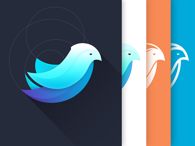
The branding contained a mark in the form of an exotic bird. I wanted the Hixle symbol to represent a part of me as this project came into existence based on my experiences as a designer. So even though I have my own story to tell, I wanted the brand to have it’s own story too. The gradient colours seen within the mark represent an animal that can adapt it’s appearance to any environment. Later on I may decide to include a logo type to compliment the mark.

The project is currently under development and I’ll soon be launching the MVP sometime in the new year. I wanted to give back what I have learnt throughout my years as a freelance designer. This project has given me an glimpse into how to approach the lean method and saving time, money and resources by talking to real people. I don’t know where this journey will lead to, it’s uncertain. But what I do know is that designers should have all the tools they need to create the best experiences.